Ooothie Smoothie Website UX/UI Design & Graphic Design
Roles
UX/UI Designer, Graphic Designer
Tools
Adobe XD, Adobe InDesign, Adobe Illustrator, Adobe Photoshop
Introduction
Ooothie makes smoothies from natural ingredients and pure products. Their goal is to bring together the perfect combination of flavor and health, while acknowledging that every individual is unique and has their own personal taste and nutritional needs. As a result, Ooothie was built on customers being at the forefront of the smoothie building process, and needed a website that gave the user the reigns.
Proposal
Challenge
How can I give users an enjoyable and personalized smoothie building experience that encourages them to return to Ooothie?
Key Objective
Ooothie should enable users to build their own personalized smoothies based on an enjoyable, easy selection process. The interface should be dynamic and interactive, and have visual elements that inform the user about what items they're selecting. After using Ooothie, the user should know they were in the driver's seat during every step of the smoothie building process, and complete the experience feeling satisfied they have created the exact product they wanted, without any obstacles.
Solution
I designed Ooothie with the user's enjoyment in mind, developing every component with the intention of making the interface more visually compelling than an average ordering system. I Incorporated numerous visual options while limiting extraneous variables in order to both give the user freedom and minimize chaos in decision making process. I considered both the flow of the page, ensuring the steps aligned with the user's instincts, as well as the aesthetic of the interface to ensure the unique elements would still be interpretable.
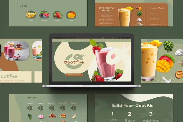
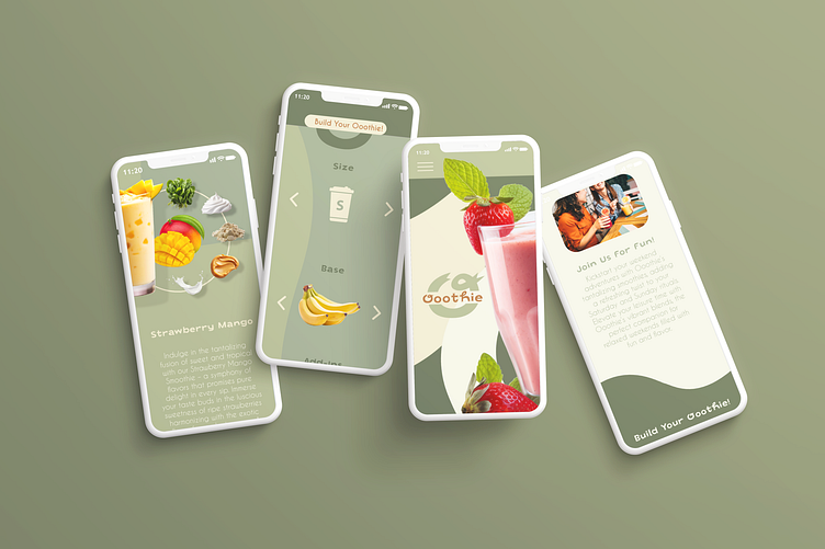
When creating Ooothie, I wanted to explore different ways of giving the user a highly visual and interactive experience of picking their smoothie ingredients. Rather than making selection filters in the traditional check box method, I implemented a selection system that displays what the ingredients actually look like. I developed two different layouts to see which interface would provide the user a more intuitive and informative experience.
When developing the brand aesthetic for Ooothie, I found the triple "O" in the name yeilded to more organic shapes. I incorporated these into the background of the landing page and used them to break up sections of information. I chose a monochromatic green color palette with pops of cream and a rustic orange as accents with the goal of pushing the underlying theme of organic ingredients. In order to balance the simplistic nature of the monochromatic shapes, I selected detailed, realistic imagery of the ingredients. These provided an ample amount of complexity and color, attracting the user's eye to the most important area of the website.
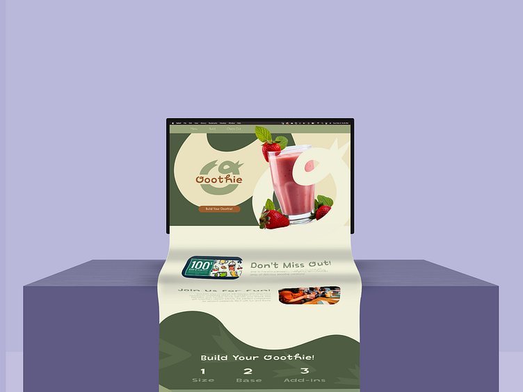
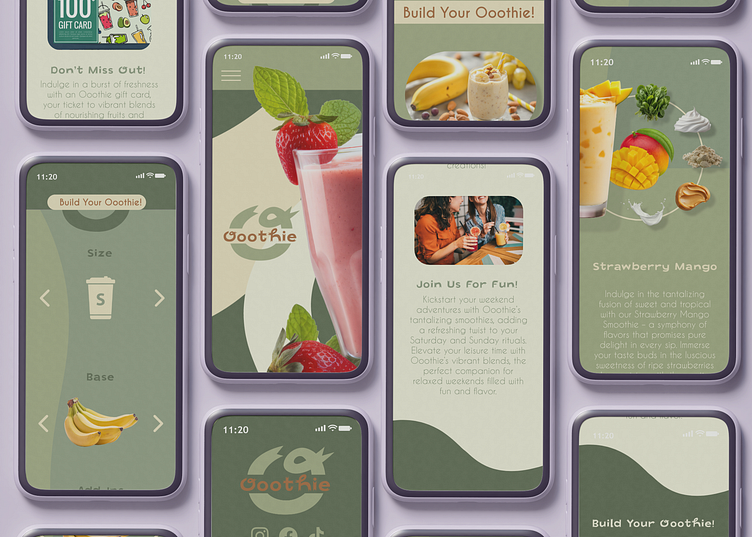
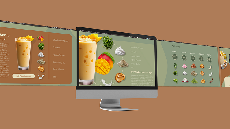
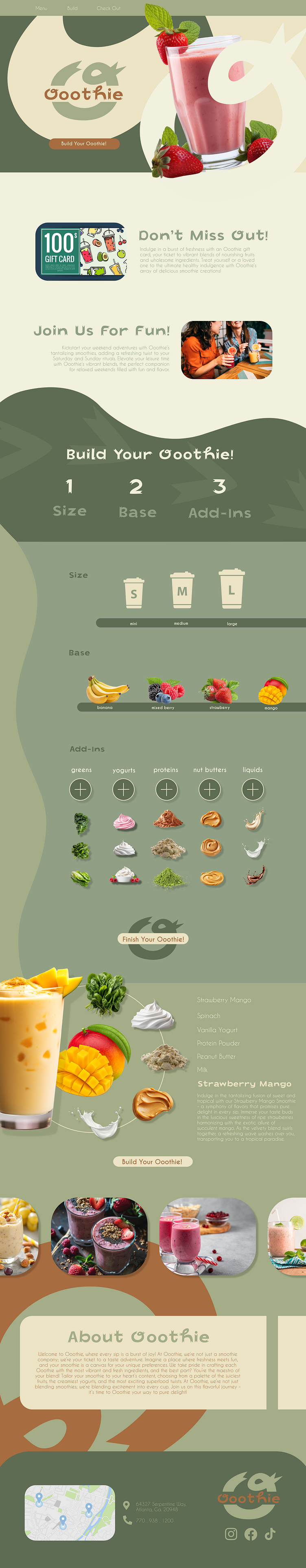
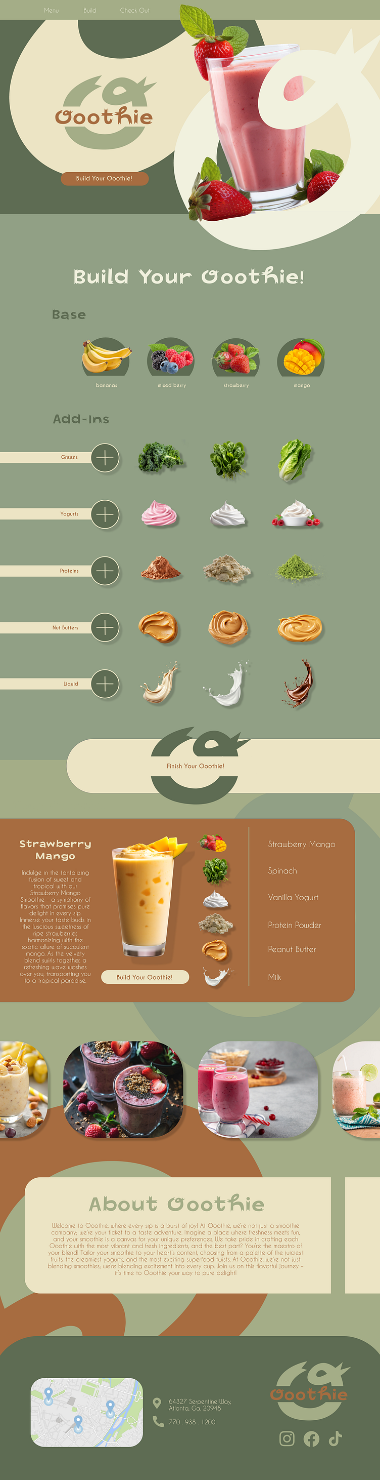
Below: Mockups of the Ooothie website
Design Analysis
User Pains
Missing a way to independently select the ingredients in their smoothie
Don't have a wide selection of ingredients to choose from
They can't visualize the ingredient going into their smoothie
User Desires
A function that allows them to see and select the exact ingredients they're putting into their smoothie
A wider variety of ingredients available
Easy selection process that doesn't require overthinking
To have a fun experience building a new kind of smoothie flavor
User Persona
Someone who cares about their health
Is interested in the quality of their food
Likes to try new things
Is a visual learner who responds positively to imagery
Enjoys smoothies
Execution
A website that establishes the high quality of ingredients Ooothie uses
Components that make the selection process entertaining and visually appealing
An organized organized arrangement of various categories that streamline the users interaction with the website
A visual depiction of the created smoothie at the end of the creation process, re-establishing all of the choices the user made along the way
The first layout I created was slightly less traditional with elements anchored to the right side of the page, that I balanced with several floating components. I chose to arrange the ingredients more simplistically to balance out a complex display of the final smoothie product and it's ingredients. In this layout, I also experimented with the order of sections by placing a column of advertising and event elements closer to the top of the page.
Below: The first layout of the Ooothie landing page
For the second layout I returned to a more traditional layout of elements, anchoring them to the left side of the page and framing the finished product section in a shape rather than leaving it free-floating. I wanted to see how the success of the page would differ without the inclusion of advertising and event elements, instead focusing predominately on the user's experience building their smoothie. This layout is more streamlined in arrangement, with a focus on streamlining the user's experience of smoothie building.
Below: The second layout of the Ooothie landing page
This is one of the first projects I completed and retrospectively I learned an incredible amount purely from jumping into the designing process wholeheartedly. This project was an excellent introduction into Adobe XD and and helped me understand more about the software and what it is capable of. If I had to re-do this website, I would revisit the item selection section and modify my sizing, I would also design the button/category elements more elegantly, as I feel a lot of them are clunky and stylistically outdated. I would want to implement more gradients and develop a better way of creating movement other than the abstract shapes I used in the background, and rework the wireframe in an effort to make the page flow more logically.
