Recruiter Dashboard
Hi everyone 👋
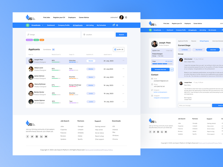
The shot depicts a recruiter's dashboard, which includes:
New Applicants:
Displays the number of new applicants who have submitted their resumes. Allows recruiters to quickly assess the candidate flow and plan actions accordingly. Resume Score:
Shows the score of each candidate's resume based on the match with job requirements and experience. Provides recruiters with a convenient way to filter candidates with a high level of suitability.
Stages:
Indicates the stage at which each candidate is in the selection process, such as review, interview, offer, etc. Helps recruiters track candidate progress and respond promptly to their actions.
Experience:
Shows the overall experience of each candidate, helping recruiters quickly assess their qualifications and potential.
Applied Date:
Displays the date when the candidate applied for the vacancy. Helps recruiters track timelines and ensures timely follow-up actions.
This shot adheres to the principles of UI/UX design, providing recruiters with a convenient interface for managing candidates and vacancies on the platform.
would be delighted to read your feedback and receive your comments.
Press L if you like it ❤️
Thank you.
I am open to your suggestions 🤠 please send your request to my email at kateryna.burych@gmail.com, or contact me via Linkedin
