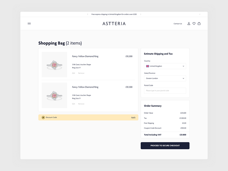
Luxurious Jewelry - Checkout Process
Client information
Founded in 2006, Astteria Diamonds is known to be as one of the most distinguished jewelry houses in London, UK. They create beautiful and exquisite diamond/gemstone jewelry with uncompromising quality, defining luxury and elegance.
Even though a client decided to go in a slightly different direction, I wanted to further explore the path I believed worked better for the customers.
Problem
Checkout process is only a part of a redesign, although it was creating the main issues, preventing the brand to achieve higher conversion rates. Previous journey was confusing and way too long for the customers, which led to high abandon rate of the checkout process. Some customers failed to find help while completing the purchase as some informations weren't clear enough, while the others struggled to go through the checkout due to numerous errors.
Solution
One of the main improvements was to make this journey less cluttered and properly structured in terms of the layout, creating a flow that's easy to scan and understand. Important messages were redesigned to be more prominent, but at the same time subtle enough not to distract the customers. Additional information has been added regarding the deliveries, including the estimated times of arrival. Also, for those who were struggling to find help during the checkout - I've added a phone information and also a customer support centre to answer the FAQ's (opening up in a new tab) - not having to abandon the whole process to find the right informations.
Responsiveness
Knowing the importance of a mobile view, this was carefully carried out in order to preserve space used and provide all the options at the same time.
📩 Say hi: crymurogue@gmail.com


