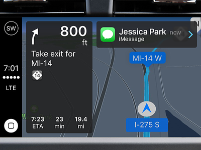
CarPlay Notifications while Navigating
One of my grievances about CarPlay is that when you are navigating somewhere and you receive a notification, a large notification banner comes across the top of the screen and blocks content. This isn't a big problem if you are in any app besides Maps. When you use CarPlay to drive somewhere, the directions stay fixed on the left side, and this large banner blocks your next instruction.
I figure there are two ways to handle this better than the current situation:
1) The banner could push down the left side content as it currently does when showing the navigation bar (not pictured)
2) Present the notification as I have in this screenshot.
The merits of 1) would be the right side with the actual map would continue to have high visibility, and you would continue to get a larger touch target for the notification banner that would come across the top. But the downside is if you want somewhere to show Maps' navigation bar with actions like Mute, Zoom In/Out, and End Route. You either can't see it until the notification is dismissed or you hide even more of the directions by pushing that left side more. This vertical stacking isn't ideal because it is prioritizing the notification over the actual problem, which is "I can't see my next direction."
So that is how I arrived at solution 2), which is pictured above. This is a smaller touch zone than the full banner but prioritizes the map instructions. Additionally, if you were to touch the map zone, you would be able to quickly get to the Maps navigation bar for those earlier mentioned actions. Because spacing is tight, I might even argue to drop the timestamp for the notification, but that's just how iOS shows them. This also harmonizes well with OS X notifications that come in on the right side.
Let me know your thoughts.
