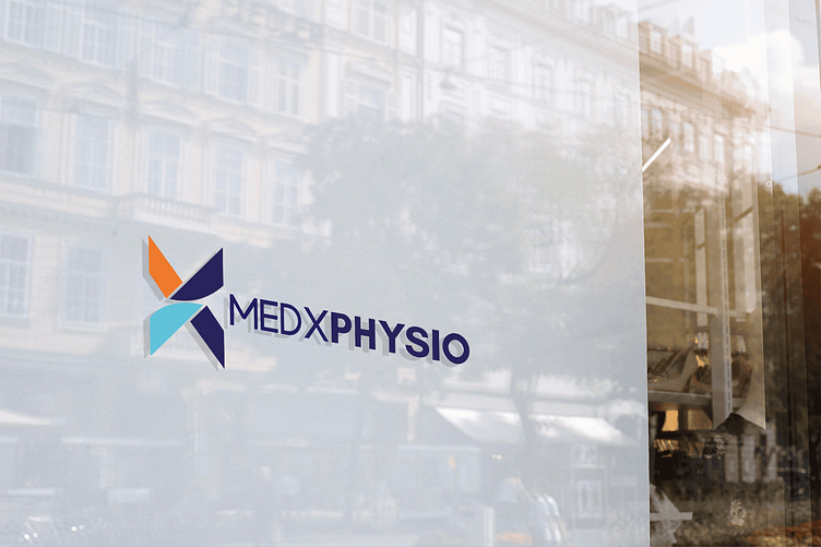
MEDXPHYSIO Logo
London Physiotherapy Startup Branding
This logo and branding concept for a London-based physiotherapy startup emphasizes its future-oriented approach and commitment to long-term healing for adults and children.
Concept Breakdown:
Symbolistic "X": This graphic element can be interpreted both as a forward-looking symbol representing development and progress in healthcare and as the shape of a spine.
Hands: Two hands, coloured blue and navy, interrupt the orange line in "X" representing the spine in pain. This symbolizes the act of care and healing provided by the clinic.
Colour Palette: Orange reflects the positive outcome of treatment, while blue and navy convey professionalism and trust.
This combined message resonates with both parents seeking care for their children and adults looking for long-term healing solutions.
Enter your text here...


