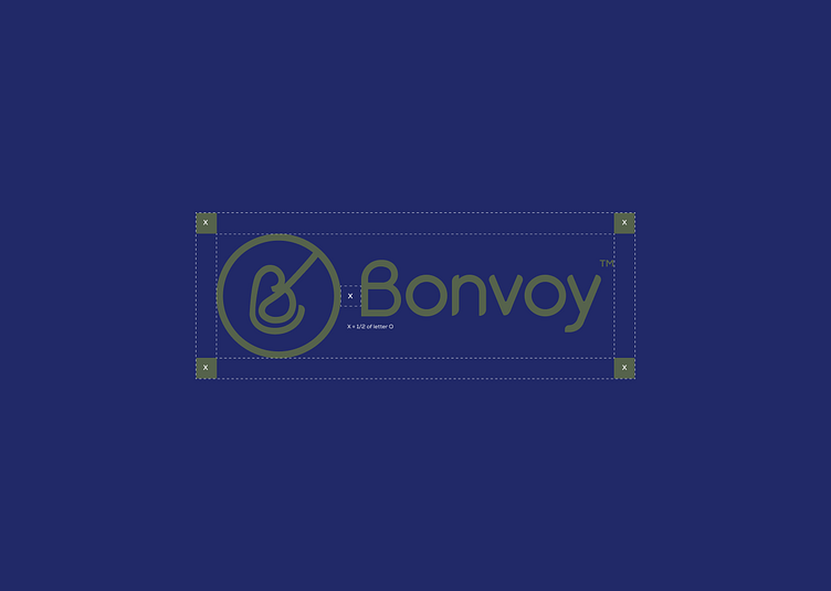
Bonvoy Clear space
The exclusion zone ensures the logo remains legible and impactful by isolating it from competing visual elements such as text and supporting graphics. The exclusion zone is equal to the x-height of the wordmark (height = 1/2 of letter "O").
This zone should be considered as the absolute minimum safe distance. In most cases, the logo should be given even more room to breathe.
Thank you for Viewing! Let me handle your next project.
Get in touch:
📩 Email: qudusabolaji78@gmail.com
Follow me
Need a Brand Identity design or development help?
📅 📞 Whatsapp: 09090474190
More by Abolaji Qudus View profile
Like
