📚 Product UX/UI Design for Online Language Learning
Hey everyone! 👋
I've been dedicating a good chunk of my time over the years to a project that's really close to my heart. It’s all about designing a platform for English language learners, connecting students with teachers globally 🌍
Sounds interesting? Scroll down for a deeper dive into the design details, challenges we faced, and the solutions I contributed to.
Design of the teacher's side
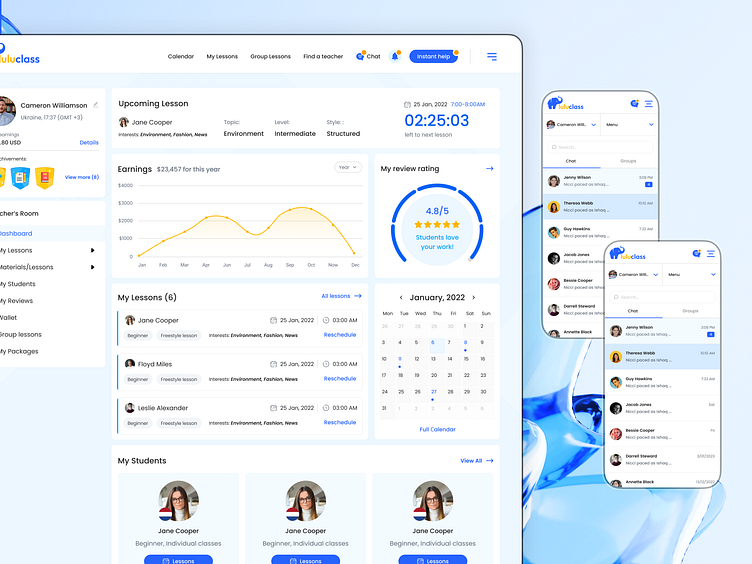
Teacher dashboard: reminders, statistics, calendar, scheduled lessons, rating, student list, and achievements.
Teacher's calendar with the ability to view and manage scheduled lessons/requests, and customize the work schedule.
Chat from the teacher's side..
Project Overview
Luluclass stands as a vibrant online platform designed to bridge the language gap, connecting English language learners with experienced teachers from across the globe. As the Product Designer, I played a pivotal role in crafting a seamless, engaging, and intuitive user experience that caters to both students and teachers.
Design Challenges & Solutions
Addressing the unique needs of both students and teachers, my approach was to streamline their interactions within the platform. This involved:
Simplifying User Paths: Enhancing the ease of navigation to facilitate quick access to essential features like lesson booking and schedule management.
Interactive Tools: Developing a user-friendly booking calendar and integrating direct communication tools to support dynamic learning environments.
Personalized Engagement: Implementing a feedback system paired with engagement drivers such as rewards and referrals, aiming to build a supportive and motivated community.
These focused enhancements aimed to remove barriers to learning, making education more accessible and effective.
Skills & Technologies
UX/UI Design: Leveraged Figma for wireframing, prototyping, and high-fidelity designs, ensuring a user-friendly interface.
User Research: Conducted interviews, surveys, and usability tests to gather insights and inform design decisions.
Responsive Design: Ensured a consistent and accessible learning experience across all devices.
Collaboration: Worked closely with developers, content creators, and stakeholders to bring the vision of Luluclass to life.
The completion of this project resulted in a user-friendly and visually appealing interface for an online language learning platform. Focusing on user needs, I implemented solutions that simplify the learning process, making it more accessible.
Student's side
Student dashboard: reminders about classes, a list of scheduled classes, a mini-calendar, academic statistics, a list of teachers, and rewards.
Convenient teacher search with filtering. When you hover over the teacher's card, you can view the video intro and an approximate availability schedule.
Teacher page: you can view details, available packages, contact via chat, book a trial or full lesson.
Calendar for booking a lesson. The duration of the lesson and the available time can be selected.
Additional things that were done as part of the project
Landing page design with inner pages FAQ, Our Team, Blog and Contact.
Design for social media
Branding: creating a logo, designing a palette and selecting typography, creating graphic decorative elements.
Looking for a collaborator to bring your project to life?
Message me now and let's make it happen together 😇
Linkedin | Telegram | WhatsApp | Skype | anzhelikachdesign@gmail.com


