Viridium - Brand Identity
Project Brief
This design study aimed to explore a potential new brand identity for Viridium, a built environment consultancy which focuses on bringing sustainable solutions to the construction industry.
Summary
Viridium's strong focus on sustainability is what truly sets them apart from any other consultancy out there. Our design had to account for that. Our aim was to create an identity that is striking, bold, slightly quirky, and have a ton of character, whilst still being instantly recognisable.
Brands within the construction industry are always quite conservative with their designs, so our concept had to be unique enough to show Viridium's personality, whilst still conveying that professionalism and trustworthiness potential clients would expect from such business.
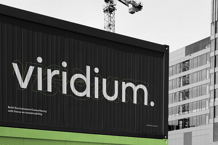
We've decided to create a visual identity that blends a clean, elegant font Mozaic Geo, with organic, abstract shapes which roughly follow the lines of each glyph in the 'Viridium' wordmark.
Those shapes were then applied to example marketing assets, in the form of extreme closeups, giving the whole brand a truly unique, yet professional feel.
In terms of colours, we've introduced a quite toned-down palette which included the classic Black and White, as well as Urban grey. Our aim was to add one striking, vibrant colour which will help show off the brand's signature look. That's how this unique shade of green was introduced.
Learn more: www.poison.studio


