Reimagining the Quip Mobile App
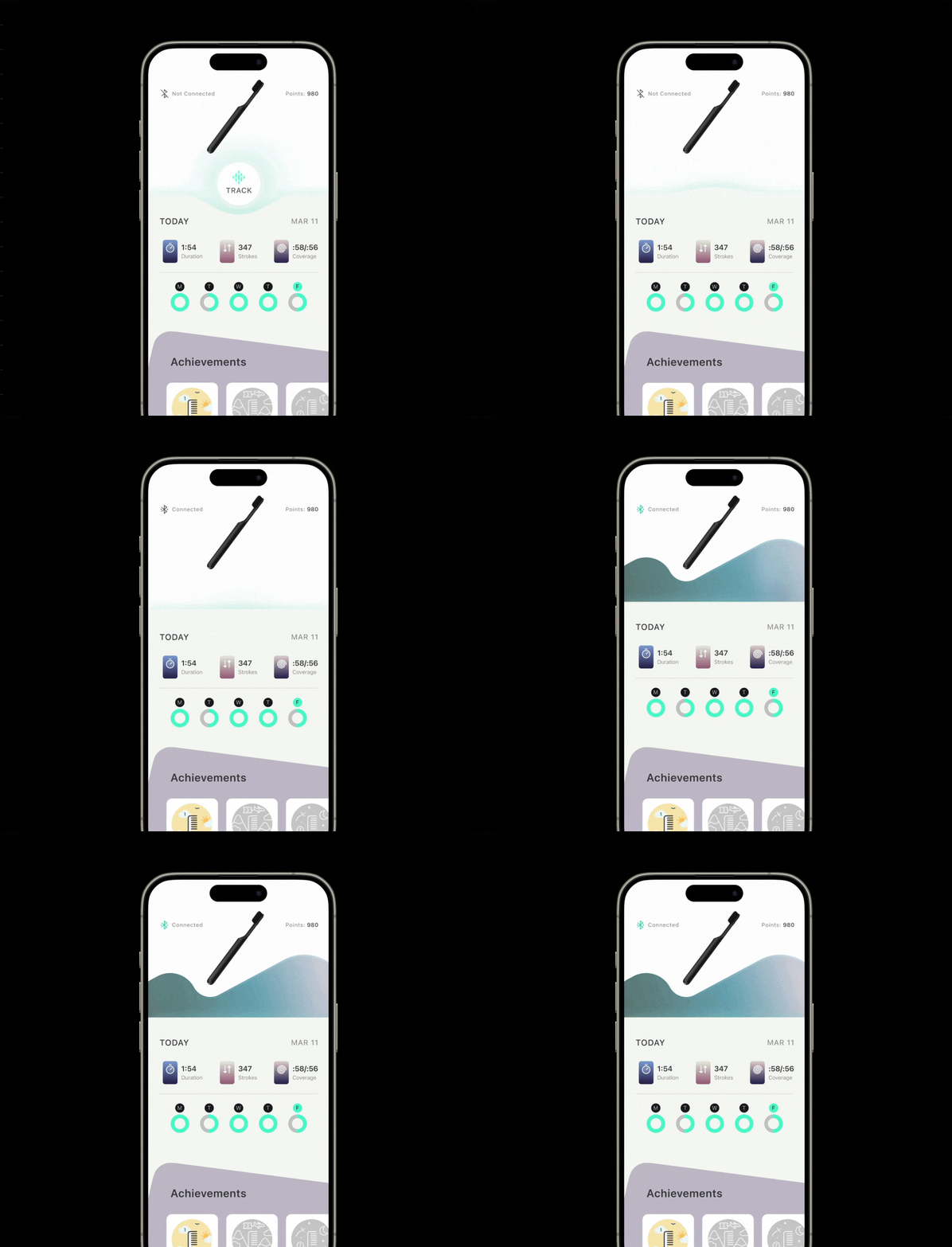
This thought experiment originated from my use and observations of the Quip app. The UI design sees a much needed refresh and simplification. In addition to that, a new feature solves for the imperfect nature of the toothbrush's bluetooth connectivity. The feature reveals a button when the brush is not connected, providing the ability to manually connect your brush with ease.
More by Sam Pietrzak View profile
Like
