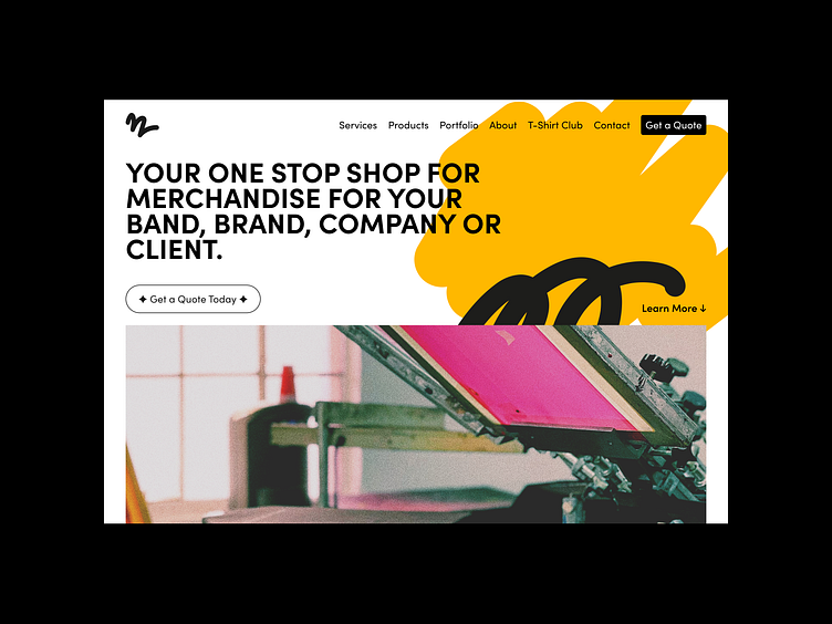
Stretch Bros Press Website Redesign
In line with Stretch Bros Press' new brand identity, this site was designed around showing creativity, without the normal cliches of brush strokes and paint splats. The scribbled background elements will line up through their social material and their advertising too.
The goal with this project was simple - to create a one page lander that detailed all the services offered, gave social proof, and stood out amongst its competitors, which are usually poorly designed and very basic.
Because of the nature of the industry's competition, Stretch Bros do not reveal prices on their site, and instead they have a quoting tool. User fill out the form and receive the price within 24 hours.
Initially, they did not have any way to add artwork or select garment types, which added an additional day or 2 to responses from potential clients.


