Death Stranding: Director's Cut - Order Summary Screen Redesign
Here's my take on the Death Stranding: Director's Cut - Order Summary Screen.
Design Process
1. Exploration
Refers to a phase in the design process where you actively gather information, brainstorm ideas, and experiment with various solutions.
Pain Analysis
CTAs should be clear and prominent to guide the player.
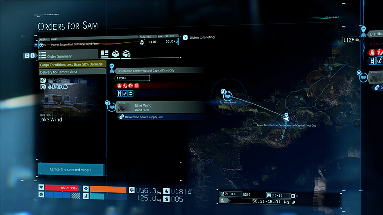
Cluttered design elements.
Inconsistent visual elements (such as icon and font sizing and placement.)
Spheric and ghosting effect on design elements makes the overall UI hard to comprehend.
Contrast Issues.
The Cure
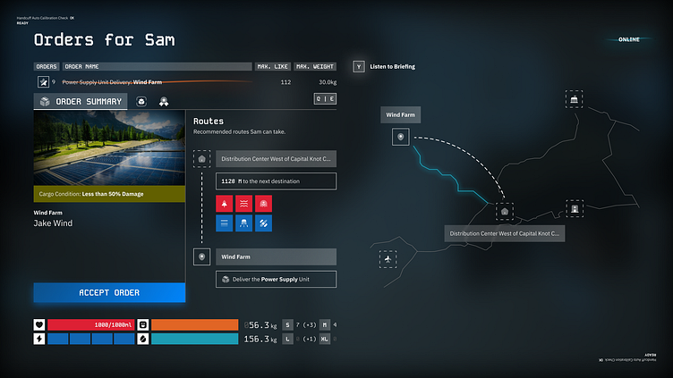
Prominent CTAs: The CTA button has been redesigned with a distinct color and a subtle glow effect to enhance its visibility and encourage user interaction.
Maximized Screen Real Estate: The layout has been optimized to utilize the entire screen effectively, preventing a cramped or cluttered user experience.
Button Placement Optimized: The placement of buttons has been adjusted for optimal usability.
Simplified Aesthetic: Removed the spheric and ghosting effects to create a cleaner, less cluttered interface. Unnecessary design elements were also eliminated, maintaining a balance between minimalism and functionality.
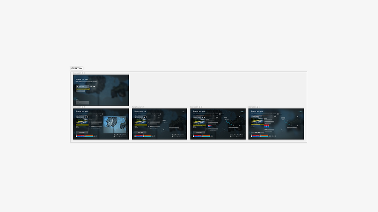
2. Iteration
Refers to a cyclical process of continuously refining a design based on user feedback and testing.
Create > Test > Analyze > Refine > Repeat.
3. Finalization
Implementing Figma Component, applying Auto-Layout, and fine-tuning to make sure the overall design is consistent.