Banking Mobile App Concept
💌 Have a mobile app idea? We are available for new projects!
hello@ronasit.com | Telegram | WhatsApp | Website
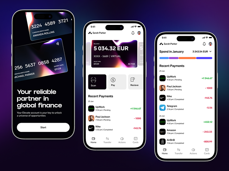
Hello everyone! We'd love to detail our design concept for a mobile banking application that offers a sleek and user-centric financial experience.
The onboarding screen guides users through the app’s features. The accounts screen provides a clear overview of the user's financial status, while the expenses screen displays a detailed breakdown of monthly spending and recent transactions.
We've chosen a minimalist color palette of black, white, and gray, which sets a professional tone and directs the user's focus to their financial data. To add visual interest, we incorporate cards with a gradient design that serves as eye-catching accents.
The design's main strength lies in its clean and structured interface, which significantly simplifies the management of personal finances and enhances the overall user experience.


