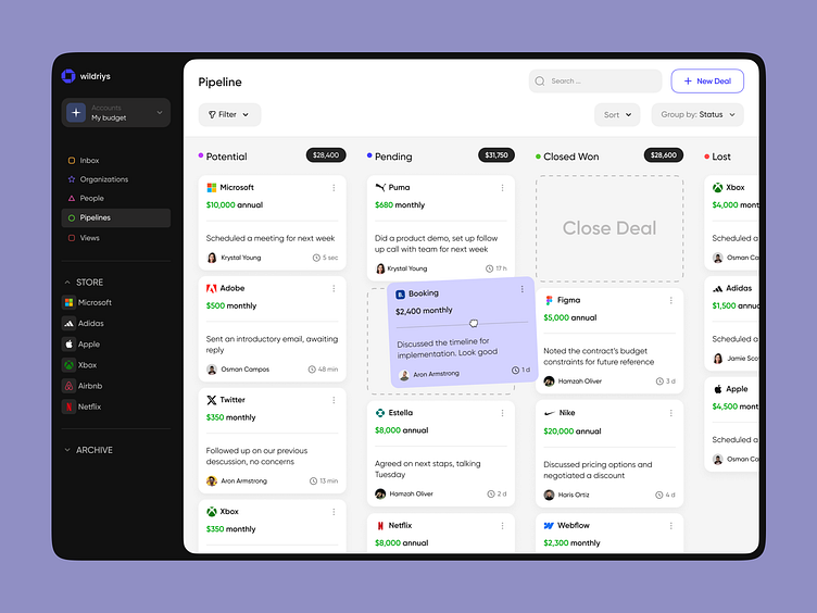
Sales Dashboard Design Concept
💌 Have a web application idea? Let's make it together!
hello@ronasit.com | Telegram | WhatsApp | Website
Hello everyone! We're glad to share the design concept for a dashboard specialized in payment management, tracking incoming payments, and their respective statuses.
On the initial screen, users can find a list of recent payments received. The second screen offers a detailed view of an individual payment, showcasing its current status and an associated receipt.
We chose a white background complemented by purple and green accents for our color palette. This selection ensures that users can focus on the payment information without visual distractions.
The dashboard's design is organized in a columnar format, breaking down payments by their statuses. This organization significantly simplifies navigation and makes searching for specific payments more intuitive.


