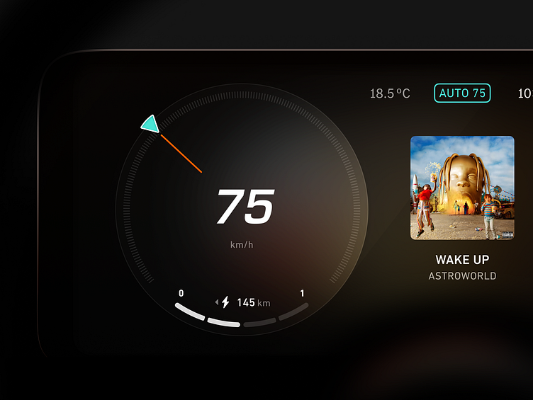
Mercedes-Benz dashboard
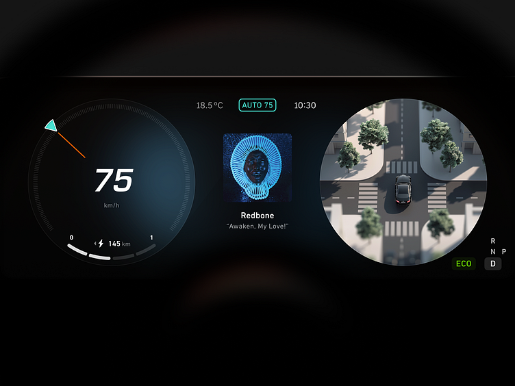
Don't you think that Mercedes chose wrong design direction UI/UX wise?
It can be so much better if UI elements had less light sources, no reflections, no fake gloss, no cringey backgrounds with mountains, no tall Daimler Corporate font illegible in small scale, no randomly placed icons etc. etc. etc...
Fonts used: DIN Next (because I noticed DIN markings on glass panel on my own Merc and liked it), Daimler Corporate S (clock & temperature 'cause OK, we can integrate that for the brand recognition), Eurostile (large numbers, I believe it's parent of the proprietary font MB uses in their modern dashboards).
Made using Figma and Midjourney (3d map view)
Thank you for watching.
Press like and comment on my designs, I really appreciate that.
