UTilities: College App Redesign
Project Details
My final assignment for a college UX class was to conduct a usability evaluation on an app of my choice. I chose to analyze our school's app, UTilities from the University of Texas.
Executive Summary
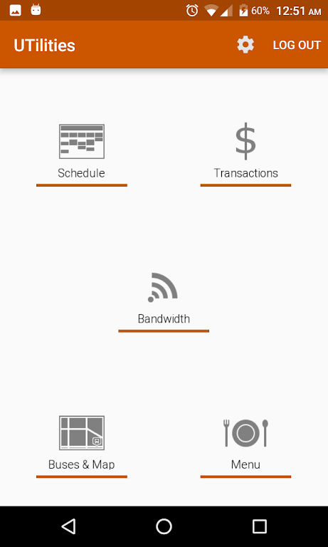
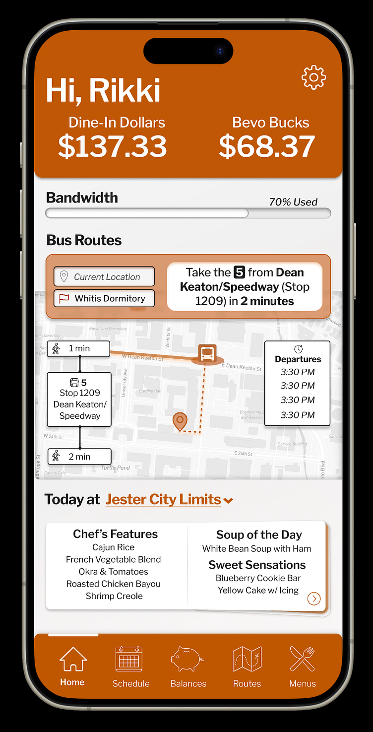
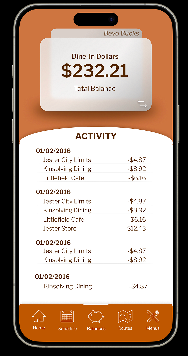
UTilities was designed to help UT students navigate college life, yet it remains widely unheard of and unused. Using the UTilities app, Students can monitor their finances by keeping track of their available Bevo Bucks and Dine-In-Dollars. They can view course schedules and exam schedules. They can map bus routes, view building names, and create custom routes between all of their classes easily within the app. They can even view the daily dining hall menu.
To better understand why the UTilities app isn’t regularly used, I surveyed a group of UT students, charted a cognitive walkthrough, and performed a heuristic analysis. I found that issues with the app generally stemmed from usability design.
First, students were unsure who the “target audience” of the app actually was. Primarily freshmen responded to the survey, and the only senior who responded said it was useful when they were a freshman. Is this an app just for freshmen, or for all students? The emphasis on features such as Dine-in-Dollar monitoring and dining hall menus would suggest UTilities is directed towards students who live on campus (mostly freshmen), but the emphasis on features such as bus routes suggests otherwise. Additionally, students who have attended UT for several years probably have no need for features like the campus map. This app may have been designed for “the UT student” – but that is such a diverse category that it’s unclear who this app is primarily intended to serve.
Second, users were often unaware of features, like the Exam Calendar or Bus Route planner, which may explain why the app has not attracted as many users. Additionally, users were generally unaware of ways to customize the app, like setting a preferred dining hall or default bus route. If the app can not adapt to user complexity, it may explain why it is not widely used. An app that just shows you your course schedule is not that exciting, after all, you can just visit the web page from your phone. However, an app that shows you your course schedule and can give you a map between buildings just by tapping the class is exciting – but users have to know that feature is available. These features also have the potential to create a more personalized experience for the user – like setting a bus route specific to where they live and where their first class of the day is – but if unused, these features are basically useless. There is a lot of potential to improve the application simply by improving user access and understanding of the design.
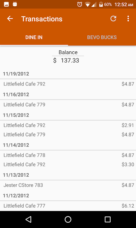
Interestingly, users also reported “bugs” with the app that actually are just usability errors. Many people said the app “kept logging them out” – the reality is, you’re supposed to enable Persistent Login, or else you have to log in on every page. Many users likely never even realized this was a feature.
Users also reported being unable to use the “Courses” section despite all their efforts – a feature that ended when the school transitioned from Blackboard to Canvas. The “Courses” icon is greyed out to indicate it is no longer available, however that has not stopped users from trying to use it. These errors in usability probably create a feeling of frustration among users that discourages them from using the app again.
In summary, users don’t have easy access to the features they want to use, yet are simultaneously shown features that are either irrelevant to them or don’t work at all.
While UTilities definitely provides many useful features for UT students, people generally get far less utility out of it than the app is capable of. Although the UTilities app embarks on the respectable mission of trying to provide technology to help orient UT students to campus, its many design flaws hinder it’s productive utility.
Design Implications of UX Research
First, outdated features like Courses need to be eliminated from the home page. At the moment, its presence mostly confuses users who believe they are not using the app correctly and gives the impression of a malfunctioning app. It also provides unnecessary clutter on the homescreen and distracts from other important features.
Second, “hidden” features need to be made more accessible. There are functions users do not even know are possible, such as charting routes between classes, that need to be made more obvious to the user.
Finally, the home page of the app needs to be customizable. The data collected from survey questions especially revealed that many users will never use many of the features on the home page. They should be able to delete them in order to improve the efficiency and convenience of their interaction. Practically, users who live off campus should be able to delete information about dining halls and add more information about different bus routes. Users who live on campus should be able to delete information about bus routes in favor of more easily accessing Transactions. Right now, the app cannot differentiate between expert users and amateurs, and presents all users with the same, inefficient navigation scheme.
Research Method I: Survey
A group of UT students were asked various questions regarding their experience with UTilities. Questions included screening questions, subjective attitude questions, and Likert scale questions. 18 UT Students filled out a survey regarding the usability of UTilities. Of those 18, 17 were freshmen and 1 was a senior. Almost all of them used Android. 44% of respondents reported using UTilities about 2-3 times a week, and 28% responded that they use it once a week. Very few responded using it daily, and very few said they’ve never used it.
The most frequently used items are Transactions and Buses & Maps. The least frequently used items are are Courses and Bandwidth. Interestingly, for each feature many people reporting never having used it, regardless of what the feature was. This result indicates that there are strong differences in the way people use UTilities. Some people never check Menu or Schedule, yet others will use those features daily.
To further explore people’s different uses of Utilities, the survey asked which feature of the application they primarily use. Most participants isolated Transactions as their primary use. Courses and Bandwidth seem to be used the least often, which is perhaps a reason they should not be main features on the home page.
Users were also asked to rate how easy they found the application to navigate on a scale of 1-5, with 1 representing “very difficult” and 5 representing “very easy”. The mean response of participants was 3.56 – so on average users felt it was between “neutral” and “easy” to navigate. When users were asked how familiar they were with all the features the app offers, users responded much more strongly with an average of 3.71, indicated users felt they had a solid grasp on the app regardless of difficulty navigating it.
Participants had the additional option of reporting any “bugs” they encountered when using the application. Many reported that they had “trouble logging in”, confirming that they were unaware of the Persistent Login feature, despite indicating earlier in the survey they felt they knew how to use all of the app’s features. People also reported that they could not get the Courses feature to work, and indicated there’s little feedback from the app that the Courses feature is not compatible with Canvas anymore.
Finally, participants were asked if there was any other feedback they would like to give about the app. Several people commented about the usefulness of their favorite feature. One person commented that the app was more helpful to them when they lived on campus, illustrating that some people still believe the app stops being relevant to them as soon as they move off campus.
Research Method II: Heuristic Evaluations
To complete the heuristic evaluation, I compared the UTilities app against the list of design principles outlined by Nielsen in Usability Inspection Methods. The app met most of the standards. It meets Visibility of System Status, whenever an item is unusable it is greyed out. There is adequate Match between system and real world, since the app uses language like "Bevo Bucks" and course schedule, which would be familiar to users. It offers user control and freedom since a user can return to the home page from any page. The app additionally offers a good Consistency and Standard since each page offers a roughly similar navigation scheme. While the app met most of the standards, there were a few design principles that it violated. The app violated Recognition rather than recall standard: instead of having options always visible or intuitively navigable, a user must memorize the location of many features and options. It also violated Flexibility and efficiency of use: users have no way to customize their homepage or many of their interactions with UTilities. For instance, students who live off-campus should be able to delete the Dine-in-Dollars and dining hall meal icons from their home page. Instead, many features remain that just serve to slow down the interaction for different users. The app does not have Aesthetic and minimalist design since it uses many klunky labels and descriptions underneath icons. There app does not meet the help and documentation standard since there is no search feature. Finally, the app violated Help users recognize, diagnose, and recover from errors: although errors were present, users were given little explanation of how to deal with them. Mainly, the “Courses” feature on UTilities has been disabled since it’s not compatible with Canvas, but the icon is still there and clicking on it returns a very generic, unhelpful error message. Users have no way of knowing that there is no way for them to “turn on” that feature.
Research Method III: Cognitive Walkthrough
Users of UTilities are primarily Freshman who need to orient themselves to the UT campus. Since mostly freshmen live on campus, they are also the ones who would need to use features such as Transactions, which keeps track of a student’s Dine-in Dollars and Bevo Bucks balances, and Menu, which lists the meals available at a dining hall each day. To conduct a cognitive walkthrough, I’ll simulate a user setting up several tasks: 1) logging in to the application using my UTEID, 2) viewing my schedule, and 3) planning a bus route.
When first using the application, a user may feel very inconvenienced, since the app requires you to log in on every page if you have not set up Persistent Login. To set up Persistent Login, a user must notice the small settings icon in the corner and click it. Once there, you simply enter your UT EID and password, and the application stores your information forever. You no longer need to login on every page. However, a first time user may not even realize this is an option.
Once Persistent login is enabled, a user simply needs to click the back arrow to return to the home page, and click on “Schedule” to view their schedule. “Schedule” is represented with both an icon and a label, and is hard to miss.
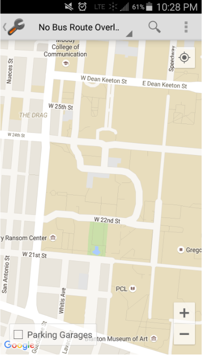
To plan a bus route, from the home page the user clicks on “Buses & Map” which is also represented with both a label and a large icon. This page could be confusing to users, since a user must then know to change “No Bus Route Overlay” to their preferred bus route to make a bus route appear at all on the page.
Then, a user needs to click on a bus icon to view the times the bus will be at that stop. Finally, a user must know to click on the icon in the top right corner, which then offers a drop-down list with an item to show buildings on the map. When that feature is enabled, the map becomes way too cluttered to use, because an unlabeled icon will appear above every building on campus.
Original App Design: