Fly UX
The Fly UX mobile app was designed as a project during my ‘Professional Diploma in UX Design’ course with the UX Design Institute.
The project (my first in UX design) was tailored to guide me through the process of researching, designing, and prototyping a mobile app for a fictional start-up airline.
Step 1: Research
I had two key research goals: 1) learn from competitors’ booking experiences (competitive benchmarking) and 2) understand users’ perspectives (user research).
Competitive Benchmarking
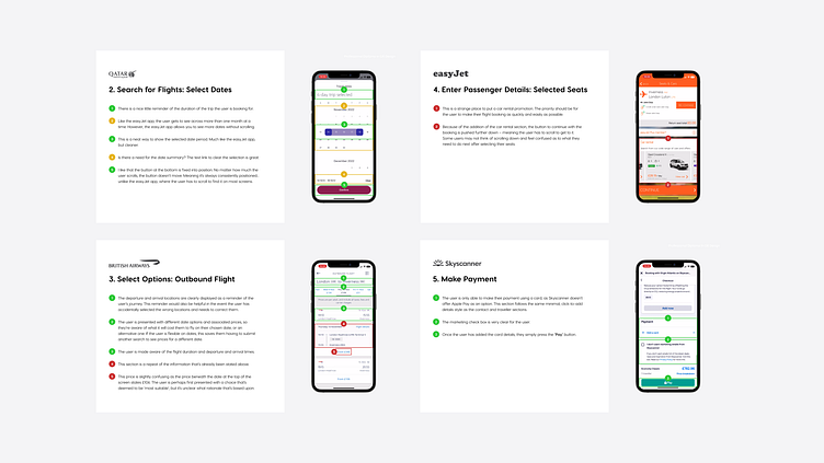
I chose to study the easyJet, British Airways, Qatar Airways, and Skyscanner apps for a variety of references. I did that by putting myself in the shoes of a user and flowing through their booking experiences. That allowed me to identify the positive and negative elements of their experiences, which I could use as inspiration when it came to designing the Fly UX app.
User Research
The UX Design Institute provided two usability test examples within the course material. I watched through those and made note of the comments the users made while flowing through the Aer Lingus and Eurowings booking experiences. In addition, I conducted an online survey and usability test of my own for further insights. The combined insights gave me an understanding of users’ goals, behaviours, and pain points – which was invaluable information that would guide my design decisions later on.

Step 2: Design
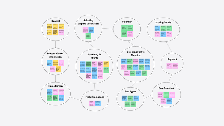
The first step of the design phase was to make sense of all the research insights by creating an affinity diagram. Those insights were going to guide my design decisions, so it was important that they were structured and usable.
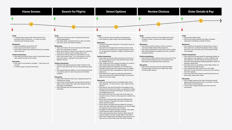
Customer Journey Map
The next step was to create a customer journey map. The goal was to define the high-level steps a prospective user would take to book a flight using the Fly UX app. The steps in the process were informed by the goal, behaviour, and pain point patterns I identified from the user research.
Flow Diagram
Once I had the customer journey structured, I was ready to define the Fly UX booking process. The purpose behind this was to understand and craft how users will flow through the app, so I could then design around that flow.

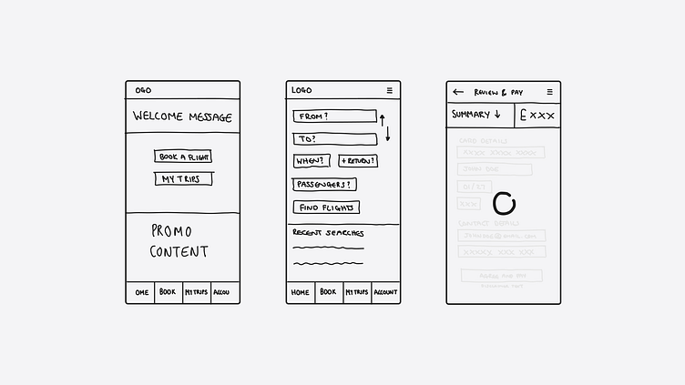
Screen Sketches
Now that I’d defined how the app should flow, it was finally time to start visualising it. Before jumping head-first into Figma, I created a list of screens and states based on the flow and sketched each of them out. This was helpful as it enabled me to paint a picture of how the app could look and work, which saved a lot of thinking time when it came to actually designing it.
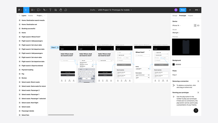
Step 3: Prototype
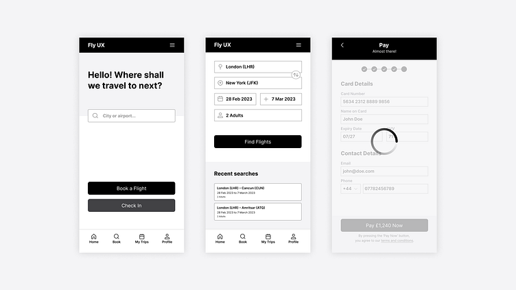
The final step of the process was to take the sketches and turn them into a clickable prototype in Figma. As the brief asked for medium-fidelity, I kept the aesthetics minimal, but added a good amount of layout, text, and interaction detail.
The result was different to what I had initially sketched, because my designs evolved as I continued to iterate, but the screens remained aligned with the user flow. An example of something I didn’t sketch was the search bar on the home screen. As I iterated, I thought why not give the user the ability to search for where they’d like to go as soon as the app opens?
Usability Test
I also asked family and friends to test the prototype and conducted a usability test. Fortunately, the testing went very well and the prototype was perceived to be fast, easy, and intuitive (success!). There were suggestions around adding more detail, but the users understood that those were applicable to a high-fidelity prototype.
Annotations
The ultimate step of the project was to create a set of annotations including details a developer would need to build my prototype into an accurate application.

Result and Reflection
You can view my clickable medium-fidelity prototype here.
This app was not actually built and launched, so I can’t speak to the impact it had on users and a business. But I can speak to the impact it had on me.
This was my first product design project.
It exposed me to level of design thinking and attention to detail required in order to design software.
It helped me to develop a great understanding of the UX design process.
I enjoyed learning key research, design, and prototyping skills – including usability testing, mapping user flows, and building prototypes.
I developed my first case study to kickstart my product design portfolio.
And most importantly, working on this project made me feel even more convinced that product design is the right field for me!

