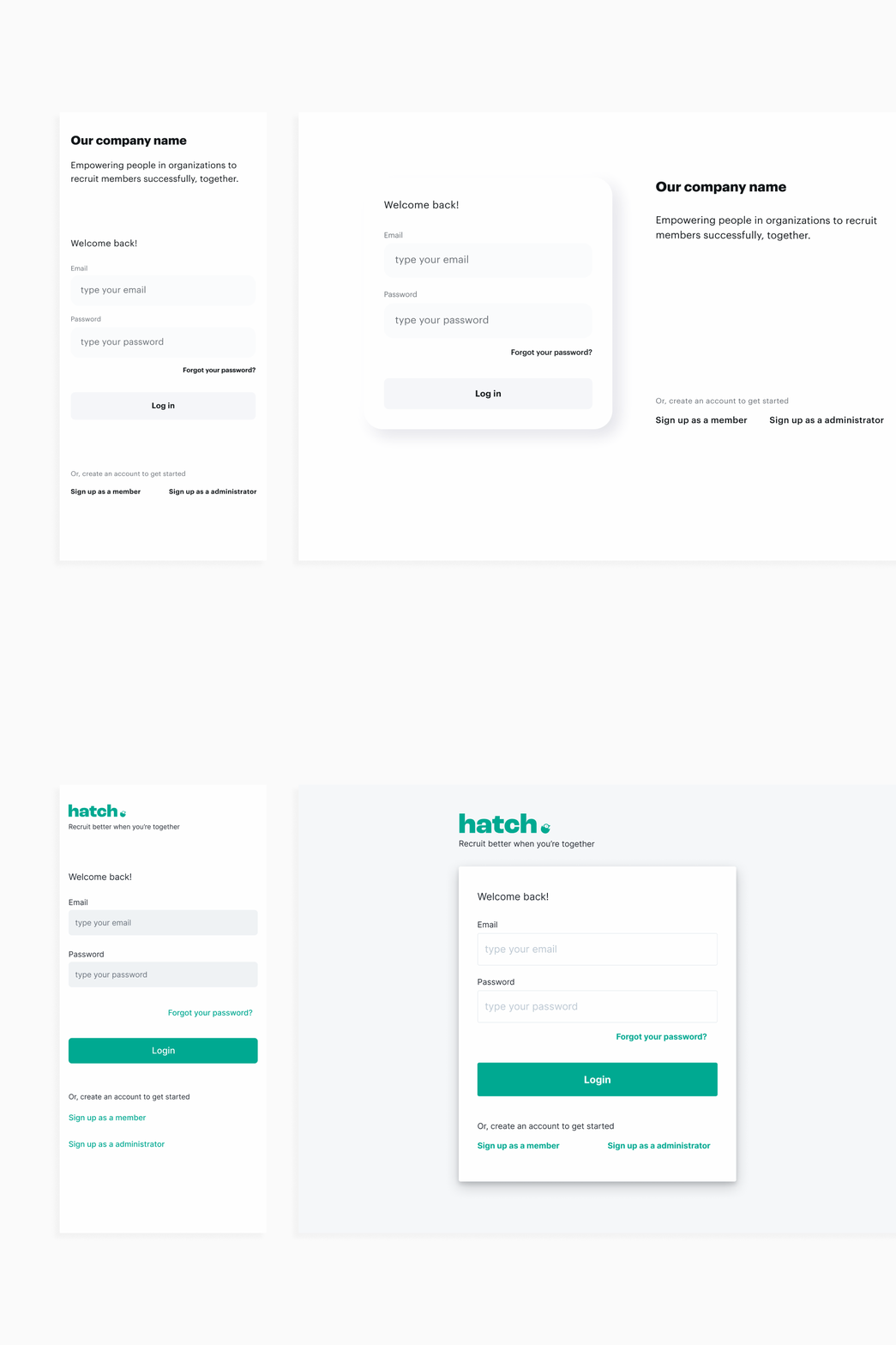
minimalist web app login wireframe to high fidelity
isn't this cute. it is a wireframe of mine and co-founders product login screen before we knew our name or brand or anything and what it looked like after. i will post more of these because we wireframed the whole product. i don't really believe in wireframes so much anymore because it's so easy to do stuff in high fi but there definitely is a time and a place for it and i think creating a new product from scratch is def one of them.
website emilyreadey.art
More by emily readey View profile
Like
