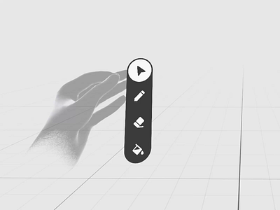
Spatial Figner Menu [Depth Layout]
This time, I explored the finger menu with a depth-based layout. Felt fun. Microinteractions/UI motion helped to compensate for the lack of haptic feedback by providing rich visual clues and reinforcing the user's intentions (all these subtle micro-movements).
Based on the prototype, here are a few things to consider when you use this interaction pattern:
1) Perspective visual distortion. It might take more time to recognize visually distorted signs when they are arranged by depth. It's a good idea to use well-known sign sequences where the current selected element gives you a hint about the previous and next ones. A user should have an embedded knowledge of how the elements in the menu are sorted. A number selector might work well with it. Like this.
2) Low range of hand movement in stationary mode. Because you need to keep visual contact with the UI, the useful range of possible hand movement is very limited. You must position your hand in front of your eyes, maintaining a comfortable distance. It restricts the number of items you can have on the menu. Plus, the trigger distance (30-40mm) also reduces the amount of menu elements you can use. Two or three items work the best (four is max).
