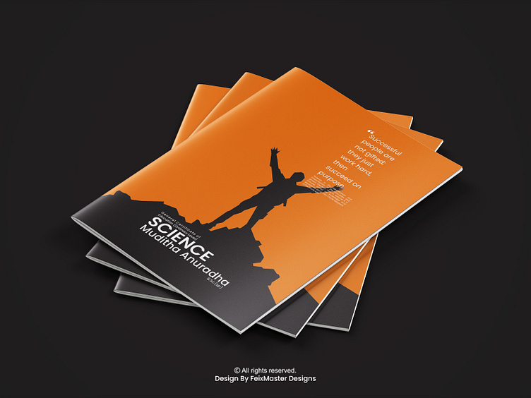
A3 Two Color Tute Cover Design | Science
A3 Tute Cover Page Design
Enter your text here...The design of a Tute cover page is important because it serves as the first impression for the educational materials and can influence how engaging and professional the content appears. A well-designed Tute cover page should include the following elements:
01 Title: Clearly state the title of the tutorial. This title should be concise and give readers a sense of what the tutorial is about.
02 Course Information: Include relevant course information, such as the course name, course code, instructor's name, and possibly the date or semester.
03 Images/Graphics: Use images or graphics that are relevant to the subject matter of the tutorial. These visuals can help make the cover page more visually appealing and convey the topic at a glance
04 Color Scheme: Choose a color scheme that complements the content and sets the right mood for the tutorial. Ensure that the colors are harmonious and provide good contrast between text and background
.
05 Typography: Select appropriate fonts for the title and any additional text. Use legible fonts that are easy to read. Consistency in font choices throughout the cover page is essential for a polished look
CONTACT INFORMATION
Please Feel Free To Contact Me,
whatsapp:- 078 601 0313
Thank you!
(Design By FeixMaster)

