Strivacity | Web Development
Knowing the customer identity and access management space to be very competitive, we approached the Strivacity website design with goals of differentiating them from the competition with unique brand elements.
We wanted them to outshine their competitors and show up with a bold and memorable design.
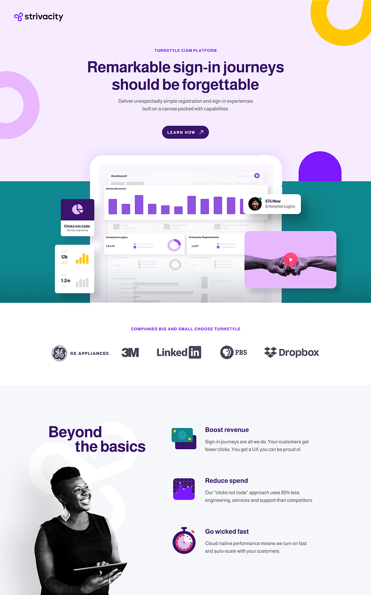
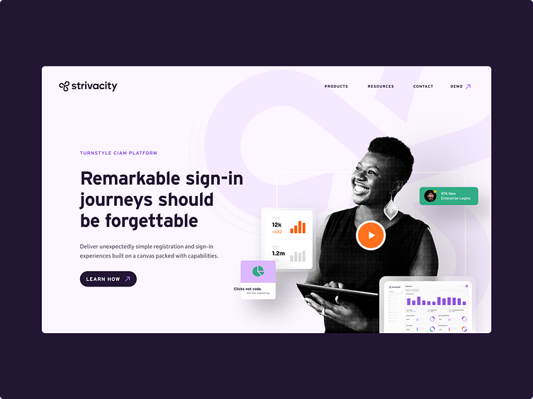
Our imagery features manipulated photography layered upon a bold color palette to add excitement and delight to everyday scenes. A halftone texture brings in a stylized touch to differentiate the brand from the competition.
Iconography is led by bold, flat colors that draw from a brave palette, while strong graphic shapes compliment the simplified yet diverse imagery.
Stylized product snippets set in futuristic, frosty tech frames showcase unique portions of the product UI, keeping messaging easy to read and guide the viewer to pertinent information.
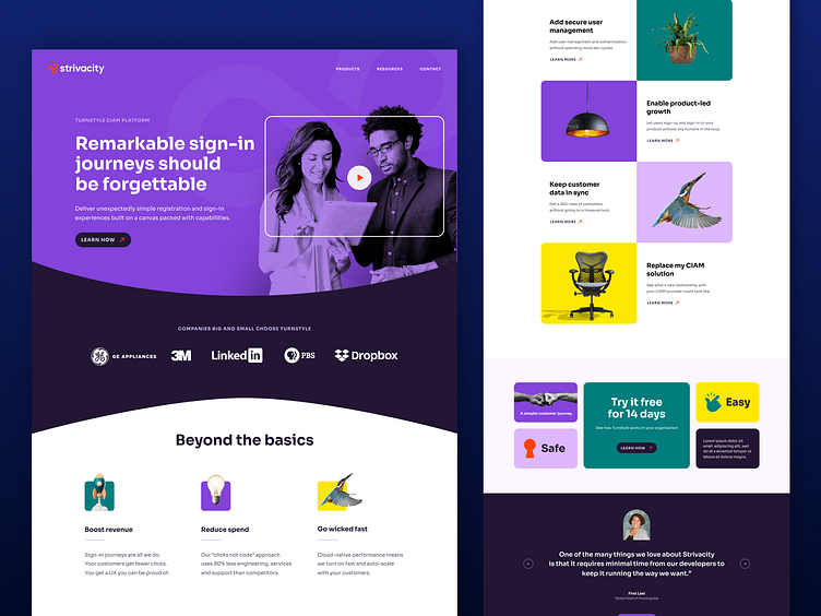
Overall, the Strivacity brand identity system was composed of flexible components designed to work harmoniously to meet a wide range of communication needs and the website is just the start of that visual communication.
—
brightbase
A better creative service built around your business. brightbase is the new alternative to freelancers, agencies, hiring, and subscription services. Fast, flexible, full-service creative and web teams. Made to scale.
