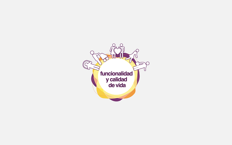
Funcionalidad

... y Calidad de vida
The Brand image for Functionality and quality of life encapsulates the very essence of the recovery journey experienced by patients facing functional challenges. Depicted by dynamic waves, this image evokes a continuous movement, symbolizing the process of transformation and overcoming that characterizes the patient's experience.
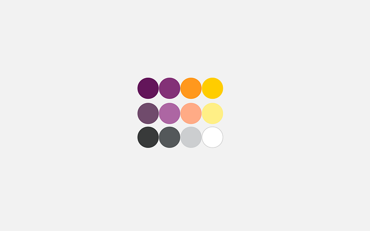
The carefully selected shades of yellow, orange, and purple in the color palette not only offer a striking visual contrast but also communicate a sense of vitality, optimism, and renewal. These colors not only grab attention but also inspire confidence and hope in those seeking to regain their functionality and quality of life.
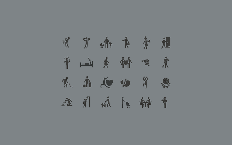
This design is not merely static; it is dynamic and full of movement, reflecting the fluid and progressive nature of the recovery process. Accompanied by a set of distinctive icons spanning from restoring basic mobility to reintegrating into meaningful daily activities, this logo serves as a beacon of inspiration and motivation for those aiming to overcome obstacles and achieve a fulfilling and active life once more.