Clinic Website Design Concept
💌 Have a website idea? Let's bring it to life together!
hello@ronasit.com | Telegram | WhatsApp | Website
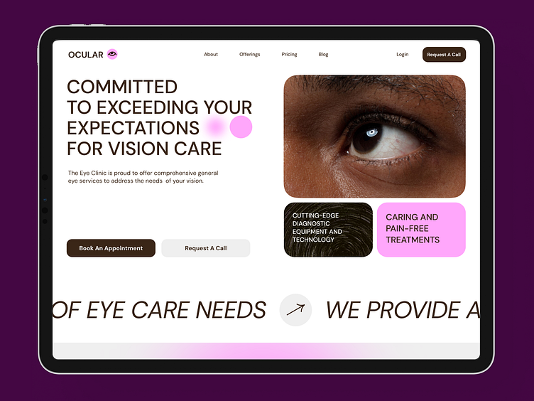
Hello! We’d love to present our design concept for the landing page of an ophthalmology clinic. Let’s take a closer look.
The website showcases the clinic's services, modern technologies used, and the benefits of choosing their expertise. Visitors can easily book an appointment by selecting a date and time or request a callback for more information.
We selected a soft pink color scheme to convey the clinic's gentle approach to patient care. This choice underlines the clinic's dedication to creating a comforting and nurturing environment for its patients.
The design prominently features large, bright call-to-action buttons and presents information in a clear, structured manner. This setup guides visitors effortlessly towards the desired actions, such as calling the clinic or booking an appointment, ensuring a seamless user journey from the landing page to the clinic’s doors.


