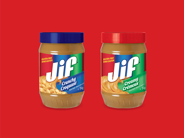
Jif peanut butter
Jif peanut butter launched in Canada, but was discontinued in 2010 due to slow sales—it couldn't compete with their rivalling Canadian teddy bear brand, Kraft peanut butter, which Canadians grew up with.
A leading brand in the US, Jif peanut butter was part of many people's childhood. This has created a very strong brand image with consumers in the US, however the Canadian market did not have these references when it came to choosing the brand. That's why the brand needed to have a modern look in order to gain competitiveness, but without losing its identity so that they don't lose loyal consumers.
Jump ahead to 2017, Jif relaunches in Canada with a new design strategy.
The Jif brand packaging has always had striking characteristics like the red, blue, green colour blocks and typographic logo. These elements make up the visual heritage of the brand built since 1955. For the relaunch, CVi design agency decided to keep the original colours of the packaging, adding a slant to the iconic logo to make it look dynamic and modern.
One last note, I grew up on Kraft and Jif wins in a blind taste test anyday! 🤭

