PixelPulze.Pro - Brand Identity Design
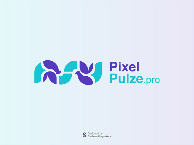
PixelPulze, where the art of brand identity design comes to life in vibrant hues of blue and purple. As the architect behind its emblem, I meticulously crafted a symbol that embodies not just our ethos but also serves as a beacon of inspiration for both internal and external stakeholders.
The logo isn't just a static image; it's a versatile mark that seamlessly integrates into various mediums, from sleek digital platforms to imposing sculptures adorning public spaces. It's a testament to our commitment to excellence in both inbound and outbound marketing endeavours.
The choice of colours wasn't arbitrary; it was a deliberate selection aimed at encapsulating its core values. Blue, symbolizing wisdom and hope, reflects its dedication to continuous teaching and growth. It serves as a reminder that within the realm of design, there's always room for exploration and innovation. Meanwhile, purple exudes an air of nobility, representing their unwavering commitment to craftsmanship and quality.
At PixelPulze, they don't just teach design; they empower individuals to unleash their creative potential and carve their own paths in the dynamic world of brand identity.
Logo Design Concept
The logo design for PixelPulze is a testament to creative ingenuity and strategic branding. Derived from the letters "P" in both "Pixel" and "Pulze," the emblem is crafted with meticulous attention to detail. One of the "P" letters is rotated 90 degrees, while the other is rotated 270 degrees before being combined to form the cohesive emblem. This intentional design approach underscores its commitment to innovation and uniqueness in visual representation. This thoughtful execution ensures its logo stands out in its elegance and symbolism, resonating with their audience while encapsulating the essence of our brand identity.
The logo design for Pic a testament to creative ingenuity and strategic branding. Derived from the letters "P" in both "Pixel" and "Pulze," the emblem is crafted with meticulous attention to detail. One of the "P" letters is rotated 90 degrees, while the other is rotated 270 degrees before being combined to form the cohesive emblem. This intentional design approach underscores our commitment to innovation and uniqueness in visual representation. Such thoughtful execution ensures our logo stands out in its elegance and symbolism, resonating with our audience while encapsulating the essence of our brand identity.
Logo Design Variations
Logo Colour Variations
Brand Applications
PixelPulze - Letter Head Design
PixelPulze - Business Card Design
PixelPulze - Notebook Design
PixelPulze - Merch Design


