Job Search Platform Concept
Hi, Creatives 👋
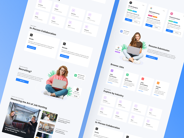
I am pleased to introduce a Dribbble shot showcasing new job search platform. My UI/UX design helps users navigate easily and find jobs that meet their needs.
User-Friendly Interface: Platform has clearly organized categories, allowing users to quickly find relevant vacancies. Categories are divided by industry and job type for maximum convenience.
Job Selection: Users can easily choose whether they are looking for office-based work or interested in remote positions.
Information for Recruiters: Design also addresses the needs of recruiters. I provide the ability to add detailed information about job listings, including candidate requirements and contact information.
Interview Preparation: Site also features a section with articles to help users prepare for interviews.
UI design is light and simple, with accents on key information and icons to help users navigate quickly. The color palette is chosen to create a harmonious and pleasing interface.
I would be delighted to read your feedback and receive your comments.
Press L if you like it ❤️
Thank you.
I am open to your suggestions 🤠 please send your request to my email at kateryna.burych@gmail.com, or contact me via Linkedin
