Job Search Platform Concept
Hi, Creatives 👋
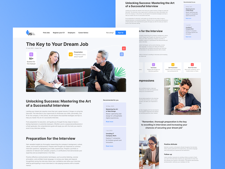
Page that tells how to prepare for an interview. The title is placed at the center of the top part of the shot. A clear and attractive font is used to grab attention.Images illustrate the stages of the interview: greeting, main questions, conclusion.
Each stage is marked with understandable icons or thumbnail illustrations. The color palette corresponds to corporate colors or uses psychologically suitable colors that promote confidence and calmness.
This UI/UX design for a Dribbble shot provides users with clear instructions and motivation for navigating the interview process, using effective and attractive web design.
I would be delighted to read your feedback and receive your comments.
Press L if you like it ❤️
Thank you.
I am open to your suggestions 🤠 please send your request to my email at kateryna.burych@gmail.com, or contact me via Linkedin
