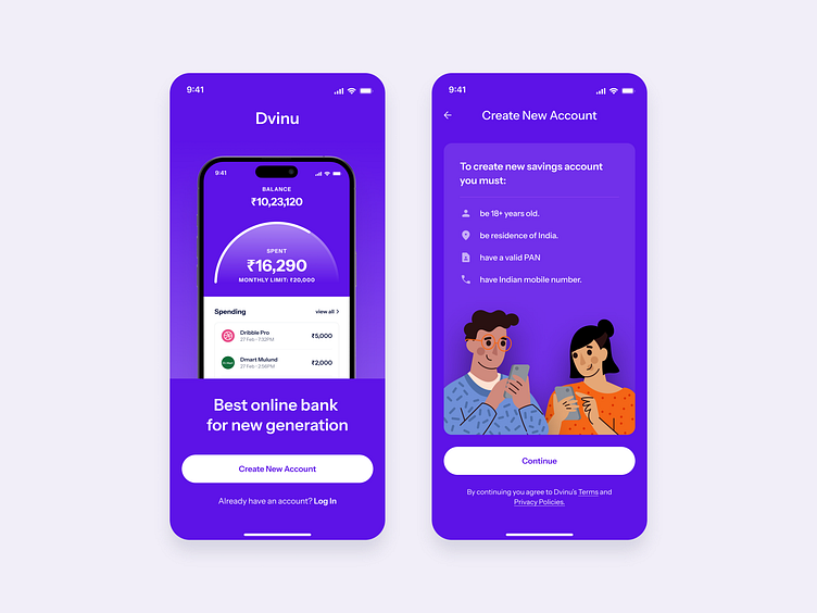
Banking App
This user interface contains the following things:-
Clear and concise information: The text is easy to read and understand, and there is not a lot of clutter on the screen.
Balance of information and white space: There is enough white space around the text and other elements on the screen to make it easy to visually distinguish between them.
Clear calls to action: The buttons are clear with good/big touch targets.
Liked our work and want to work with us?
Email us at 📩 hi@dvinu.com or 📞schedule a call
---
Follow us on Dribbble • Twitter • LinkedIn
Visit our website 👉🏾[dvinu.com]
More by Dvinu View profile
Like
