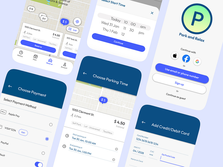
Coursera #3 - Parking App Case Study
Here is my third and last project completed as a part of the UX Design course in Coursera.
Overview
The parking app is designed to help vehicle owners of all ages find and pay for parking spots in major cities. With its user-friendly interface, the app simplifies the process of locating and reserving parking spaces. Busy vehicle owners, in particular, require a quick and efficient experience when using the app to find and pay for parking.
My role was to conduct user research; define the problem and provide insights to inform the ideation phase; define personas, user journeys, empathy maps, and user flows; visual design of low-fi and high-fi wireframes, prototypes, and usability studies.
The problem
Busy vehicle owners need a quick and user-friendly app experience to find and pay for parking.
My goal
Design a parking app that enables users to easily find and reserve parking spots by providing clear navigation and offering a fast checkout process.
User research: summary
I conducted user interviews and created empathy maps to understand the target users and their needs. The primary user group identified through research consists of vehicle owners who require an easy solution to access parking information. This includes details such as prices, time limits, and payment processes. By having access to this information, users can identify the most convenient parking areas, allowing them to avoid getting parking tickets.
Research revealed that challenges users might face using other parking apps include a lack of smooth experience due to issues with the checkout process and confusing navigation. This frustration affects many target users whose primary goal is to pay for parking easily and quickly directly from their vehicle, allowing them to save time for other daily tasks.
Customer persona
Sara, a busy housewife, needs a fast and user-friendly parking app to efficiently pay for parking, allowing her to fulfill various tasks within a limited time.
User journey map
By creating Sara’s user journey map, I wanted to illustrate the process of how Sara behaves and feels while accomplishing her goals to address pain points or provide moments of delight.
App sitemap
I built user-focused flows to ensure that my personas can successfully complete their key tasks while reducing the existing pain points.
My goal here was to make strategic information architecture decisions that would improve overall app navigation. The structure I chose was designed to make things simple and easy.
Paper wireframes
I sketched out paper wireframes for each screen in my app, keeping the user pain points about navigation, browsing, and checkout flow in mind.
'Stars' were used to mark the sketch of pages that would be used in the initial digital wireframes.
Digital wireframes
Addressing easy navigation was a key user need in the designs, so I prioritized useful icon and button locations, as well as visual element placement in my strategy.
Low-fidelity prototype
To create a low-fidelity prototype, I connected all of the screens involved in the primary user flow of finding a parking stop and checking out.
At this point, I had received feedback on my designs from the usability study about page organization. I made sure to listen to the feedback, and I implemented several suggestions in places that addressed user pain points.
Usability study: findings
Search box. There was no ‘remove’ button in the search box, making it impossible for users to change the address they are looking for.
Payment confirmation. I decided to add an overlay confirmation page to make the payment process smoother for the user.
Map/List. During the process of finding a parking spot, users did not have the option to switch from the 'map' view to the 'list' view, which could enhance the user experience by providing more flexibility.
Based on insights from the usability study, I applied design changes such as improving the checkout flow by modifying the payment confirmation page.
Based on other insights from the usability study, I added a 'remove' button to the search box. Additionally, I modified the search for a parking spot page by including an option to view results on both a map and a list, with the ability to switch between them.
Mockups
High-fidelity prototype
My hi-fi prototype followed the same user flow as the lo-fi prototype, and included the design changes made after the usability study. The final high-fidelity prototype presented cleaner user flows for finding a parking spot and checkout.
View the Parking app high-fidelity prototype
Accessibility considerations
I labeled icons to make it more clear for users what each icon means.
I used only one typeface: Outfit for both headlines and body copy. Mixing too many different typefaces can make an app seem fragmented and busy.
I used headings with different sized text for clear visual hierarchy.
Takeaways
While designing this app, I learned that the first ideas for the app are only the beginning of the process. Usability studies and peer feedback influenced each iteration of the app’s design.
The most important takeaway for me is to always focus on the real needs of the user when coming up with design ideas and solutions.
Next steps
Obtain UX/UI feedback from designers with more experience in the field to improve the overall design and functionality.
After gathering all the feedback, I will make the necessary design updates in order to improve the app’s overall experience.
Create a cross-platform responsive design. The goal is to build the same experience for all users, no matter what type of device they are using.


