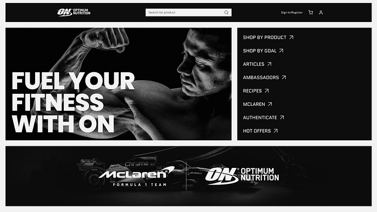
Optimum Nutrition Landing Page Redesign
Hello everyone! 👋🏻
It's a beautiful day outside, isn't it? The sun is shining, the birds are singing, and there's a cool breeze blowing. I hope you're all doing well and feeling happy.
Speaking of feeling happy, have you ever heard of Optimum Nutrition? It's a brand that's all about helping people achieve their fitness goals. They offer high-quality supplements and other products that can help you build muscle, lose weight, or just feel better overall.
Recently, I had the opportunity to explore a redesign for the Optimum Nutrition Landing Page with a Bento Grid Style. I wanted to create something that was not only functional but also attractive and engaging. After all, if you're going to be spending time on a website, it should be a pleasant experience, right?
Using Figma, I worked on creating a design that was both sleek and user-friendly. I played around with different colors, fonts, and layouts until I found something that I thought would work well.
Now, I'm hoping to get some feedback from all of you. What do you think of the design? Does it look appealing to you? Is there anything you would change or improve upon?
I'm always open to new projects and ideas, so if you have any suggestions or want to collaborate on something, feel free to reach out to me by email at 📧illustratique.uiux@gmail.com. I'm excited to hear from you!
Thank you for taking the time to read my story. I hope you all have a wonderful day and remember to always strive for your goals, whether they're fitness-related or not. Take care! ❤️
Dear Designer, 🧑🎨
I wanted to extend my sincerest gratitude for taking the time to view my recent project. Your interest and attention mean a great deal to me, and I truly appreciate your support.
Should you have any further questions, feedback, or opportunities for collaboration, please don't hesitate to reach out. You can contact me via email at 📧 illustratique.uiux@gmail.com.
Once again, thank you for your time and consideration.
Best regards,
Kamal Sheta

