Sign Up
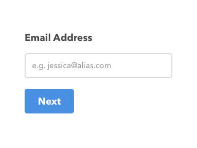
My first stab at the Daily UI challenge. The brief was "Sign Up" so I tried to think… what is the minimum needed on the first screen?
An example user journey…
1. User enters email address
2. Website sends out verification email
3. User clicks link in email. Bada bing bada boom.
4. User optionally fills out username, real name, password and uploads avatar
Have I missed anything?
More by Benjy Stanton View profile
Like
