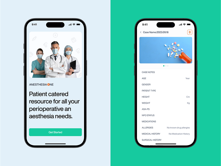
Anesthesia One - Mobile App Screens UI UX Design
Design Problem:
The existing design posed significant challenges, marked by an outdated interface, overwhelming information density, and a lack of cognitive-friendly elements. Colors and functionality were not aligned, contributing to a less-than-ideal user experience that hindered efficient navigation and comprehension.
Our Approach:
In tackling the Anesthesia One project, our approach was centered on enhancing user experience and optimizing information delivery. We prioritized user-centric design principles, ensuring a seamless and intuitive interface to streamline the user's interaction with complex medical data.
Design Solution:
Our redesign addressed these issues comprehensively. We implemented a modern, user-friendly design, simplifying information presentation and reducing cognitive load. Thoughtful color schemes and improved functionality now contribute to a harmonious user interface, ensuring Anesthesia One not only meets but exceeds user expectations in the realm of medical health projects.
At Opencore, We Unlock The Power Of Software.
Have a project?
Email as at info@opencoregroup.com or message us on Dribbble.
Follow us on:
Instagram | Linkedin | Facebook | Behance for more UI UX and Web Development content.


