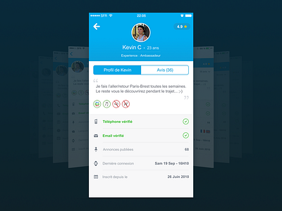
Blablacar IOS profile redesign
Hey guys, I would share with you an exercice I’ve done few weeks ago, for the Ui design recruitment process at Blablacar.
This is not a complete redesign of their IOS app, but rather an entire reflection around the profile screen.
The idea was to improve the UI of this screen while keeping close to their current guidelines.
I've decided to go step by step to explain each modifications I made and why. (That’s why this redesign is divided in 4 different screens).
Each screen can be implemented one after the other, in order to not disturbed the user with too many change in one time.
Feel free to check the attached file to discover all the process of this redesign with explanations.
I finally decided to don’t join them for many reasons.
However It was a real pleasure to meet all the design team, and discover their Parisian office :)
Thank you for your attention.

