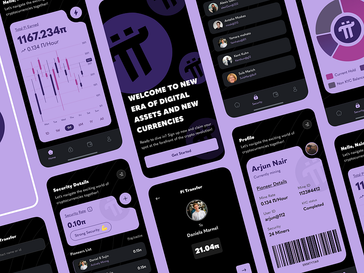
Pi Network Redesign
The main goal is to make the layout cleaner and simpler. The contents of the current pi home page are too cluttered, thus making difficult for users to use the application. Most of the redesign is based on the user interface.
Current version lacks some basic mining functionality in the current Pi network. So I decided to follow some design guidelines to ensure that users can understand the process that happens on each page.
As for the design, I try to stick with an atomic design approach that recreates every possible component for a Pi Network application. Each component was created with the aim of bringing minimillism to the Pi - Network.
While keeping designs simple, my objective was also to infuse a touch of Web3 UI that would appeal to users. Since most of the target audience are Gen Z, it's important to introduce some uniqueness while maintaining usability.
Users are often too busy with their daily lives. Providing a new way for them to earn requires a clear and simple design solution. Therefore, I established a list of rules and adhered to them throughout the entire design concept.1. Be informative, but not overwhelming. Must have a clear cut ideation of every process inside the interface. 2. Speak simple language, but maintain the borderline of seriousness. 3. Explain with components (eg graph, text-layout) as much as possible, but keep the context of mining.
Design Evaluation Checklist -
✅ Consistency: Overall look & feel
✅ Hierarchy: General purpose of the screen and clear CTA(s)
✅ Legibility: Texts are legible and readable
✅ Accessibility: Proper contrast
✅ Color palette: Proper usage and relevance


