Daily UI Challenge| Day 49 | Prompt : Notification
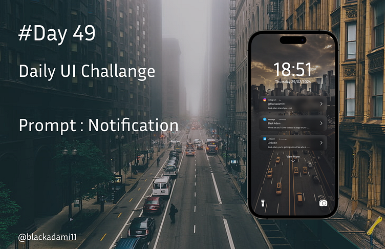
For Day 49 of my Daily UI Challenge, I went with a notification prompt that's both sleek and user-friendly. The key was to create a design that stands out against the dynamic backdrop of a city street, while also ensuring that the notifications remain clear and legible.
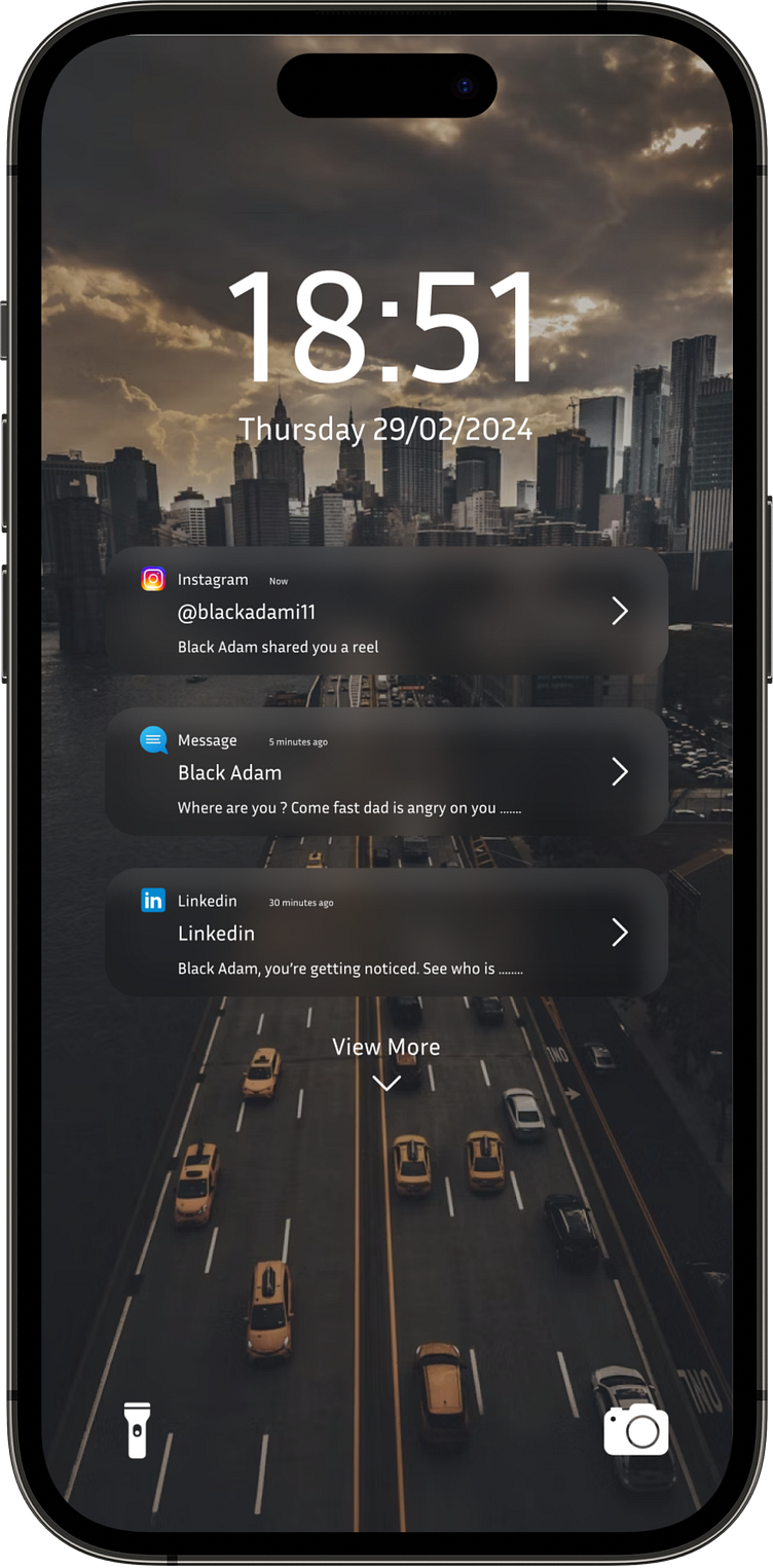
I opted for a dark theme with semi-transparent notification cards that allow the cityscape to peek through, giving a sense of depth to the interface. I chose a modern sans-serif font for the clock and the date to maintain readability and keep the design clean and uncluttered.
The notifications from Instagram, Message, and LinkedIn are differentiated by varying levels of opacity, which subtly implies a hierarchy - perhaps by importance or by how recent they are. Each app's icon is clearly displayed, providing instant recognition, and the content preview is just enough to give context without overwhelming the user.
At the bottom, the 'View More' prompt invites users to interact further with the notifications, hinting at the depth of the system without crowding the initial view.
I'm really pleased with the balance of functionality and aesthetics in this design. It's a notification screen that I believe provides a straightforward and engaging user experience, keeping you connected without pulling you away from the moment. Can't wait to hear what you all think!
