Daily UI #1: Sign Up
Please view the details here: http://trishatobias.tumblr.com/post/133947578646
Every day, this site (http://dailyui.co/) sends prompts. While it may be a bit impossible to do these daily, these are good for practice when I get some time.
I couldn’t really stand not doing anything else with it. During this process, I thought about “Oh! What if I *redesign* things instead of creating my own?” (This ended up with me spending hours just reading about best practices for sign up forms, the great dilemma that is CAPTCHA, asking people what they hate about forms and found out that if we could just input data with our minds while still retaining privacy that would be super great, etc, etc. It was an endless black hole of one page after another.)
But I felt like I was missing the whole point of the exercise and honed back in on this as a practice for improving my visuals. Loved the research portion though.
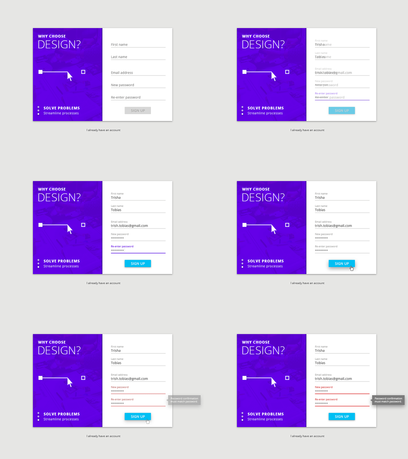
In this one, I thought about a sign up form for design as a career, with reasons for choosing it appearing on the side to compel people to devote their life and their first born (a.k.a. sign up) for it. The prompt of each input box will slide up once the user selects it when typing in their response. This is so that they don’t forget (because goodness knows how many times I forget what it is I’m typing sometimes and I really loathe having to erase what I’m typing just to see the prompt for it again.) “Sign up” button will be available for clicking once the required information is there, and if there are errors, it will tell you what those are and how to fix it.
