AMC: Design Exploration
I can't be the only one frustrated with movie theater websites, right? So, I took a stab at revamping AMC's website, with a keen focus on the general movie-goer's experience 🎬.
By tapping into the TMDB API for movie posters and logos, we're able to adopt a more modular design approach, make a bigger impact, and speed up the site by leveraging a CDN.
AMC's current approach is inadvertently harming their SEO. Embedding text within images is a significant oversight, as it hinders search engines from effectively crawling the site and when pared with the same copy is redundant. Better SEO means more visibility 👋.
If you're eager to see the design without the detailed breakdown, feel free to scroll to the bottom and click on the figma link.
Original Design:

Navigation:
The navigation felt overwhelmingly complicated. Applying the 70/30 rule, it's safe to assume most movie-goers are looking to perform basic actions:
🎟️ Buying tickets,
🎫 Purchasing gift cards,
🎬 Finding the nearest movie theatre,
👁️👄👁️ Checking out the food options,
👽 Discovering how to land a job at the cinema .
These elements are pivotal to the cinema culture and should be the focal point.
Anything beyond that feels superfluous.

Main Banner:
As most experienced designers know, scrolling sliders do not work!
They divert attention from the primary goal: allowing users to get back to their lives after purchasing tickets. Quick and easy.

Asymmetric Content:
This style of content layout is key to a scalable website. The asymmetric flow of the An asymmetric layout is crucial for scalability. It allows for visual variation while adhering to the basic principle of pairing an engaging image with value-driven text. The use of text on images along side of the copy block is overwhelming.


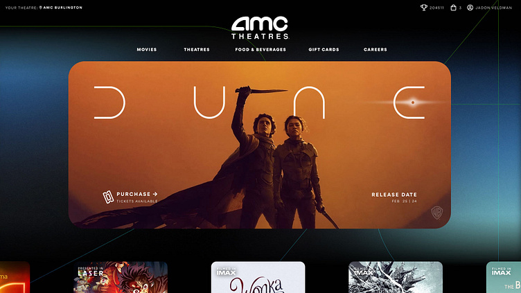
AMC Website Revamp:
Updates:
The redesign introduces cohesive design elements inspired by the logo's contours and lines. Employing layers or a 'z-index', the background is anchored to the top center, creating a parallax effect as users scroll.
I repositioned the 'sign in' and 'account' details to the top row for a more subtle presentation.
Switching from a scrolling banner to a single, focused image highlights the weekend's blockbuster. Micro animations add a discreet hint on where to navigate next.
The fonts have been refined, and additional design elements have been applied to the mobile app, offering a sneak peek of what users are about to download.
Consistent branding across all touch-points builds brand recognition and trust.
Introducing a dedicated homepage section for new movie trailers could significantly increase traffic and encourage repeat visits. After watching a trailer, users can delve deeper into the site by clicking on the main title.
The design adopts a translucent card aesthetic that could be mirrored in real-life with promotional materials, maintaining brand consistency.
Instead of direct <img> tags, background images within a <div> offer better control over responsive design. This method allows precise targeting of background position, size, and focus.

Prototype:
All trademarks, logos and brand names are the property of their respective owners. All company, product and service names used in this website are for identification purposes only. Use of these names,trademarks and brands does not imply endorsement.
Plugins used: Invert Colors | Mockup Plugin | CutOut