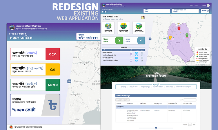
Redesign Map Dashboard
The Application was developed with a dull design and the client wanted a redesign on available data. They have a specific use case with a portal full of information. I was assigned to redesign and redefine the user flows so that the user experience could be improved.
The presentation should be in Bengali (Bangla), and there are plenty of loads already, so we cannot afford to load more fonts for the necessity of the design. For a better experience with the map, I added the map legend and redefined the color hints, and suggested scroll movement improvement as well.
I redesigned and also developed the front end for the developer and guided them on integrating the design. The experimental feature was an SVG sharing the same linear gradient of the adjacent <div>.
