QUẠT MO | LOGO DESIGN & BRAND IDENTITY
Quạt Mo [Logo and Branding Project]
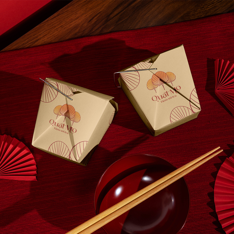
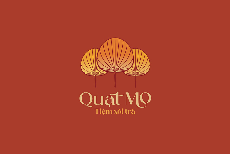
"Thằng Bờm has an areca spathe fan" - a familiar folk song in the world of folk tales. The Mo fan is known as a straightforward symbol of the farmer's "fortune", it gradually becomes a symbol of our Vietnamese countryside lifestyle. With such simple and intimate meanings of the areca spathe fan, the customer asked Kaiza to design an impressive and special logo for the brand. We devised an idea for a fan with soft rounded lines and a handle that is not too fussy but still luxurious. The logo uses stylized fonts that are both traditional and modern, creating intimacy and attracting all types of customers. Kaiza uses warm tones such as red and orange to create an overall unique logo, stimulating the taste buds of all customers at first sight.
Designed by Kaiza
Copyright © Kaiza. All Right Reserved
Contact us:
KAIZA CO.,LTD
• P: 0889 996 399
• E: info@kaiza.vn
• W: www.kaiza.vn