Finding your dream Living space takes only 2 minutes
How might we make finding a real estate property more convenient?
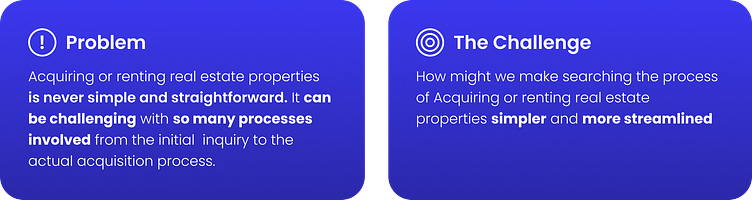
For this case study, I went over a conceptual design provided by a prospective client. The client provided a design challenge prompt, user persona, and user journey map. I was tasked with identifying and providing a solution to the problems presented in the information from the challenge.
Background

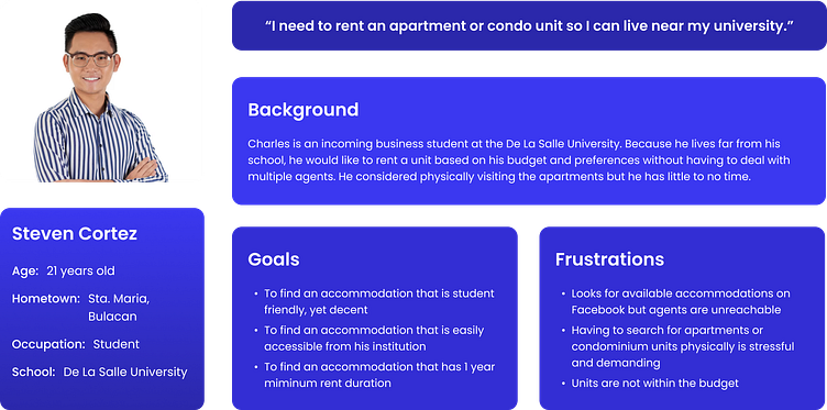
User Persona
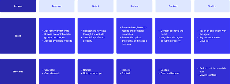
User Journey
How I Identified what to work on
From the information provided by the client, I identified potential pain points that the user encountered during the real estate acquisition process. To brainstorm solutions, I reframed them using "How might we" phrases.
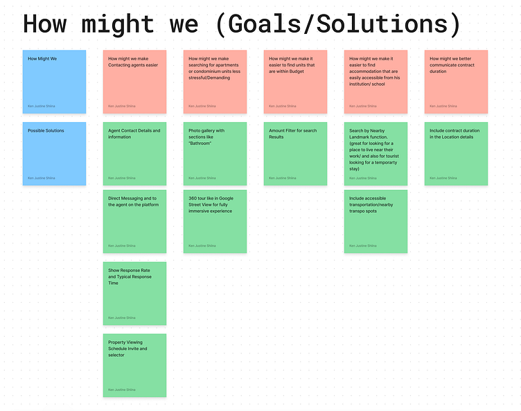
With that, I've identified the following functionality to include in the website that I decided to focus on:
Photo gallery and 360 view
Accessible transportation and leisure spots
Property search filters
Property agent direct messaging
Home Page Design
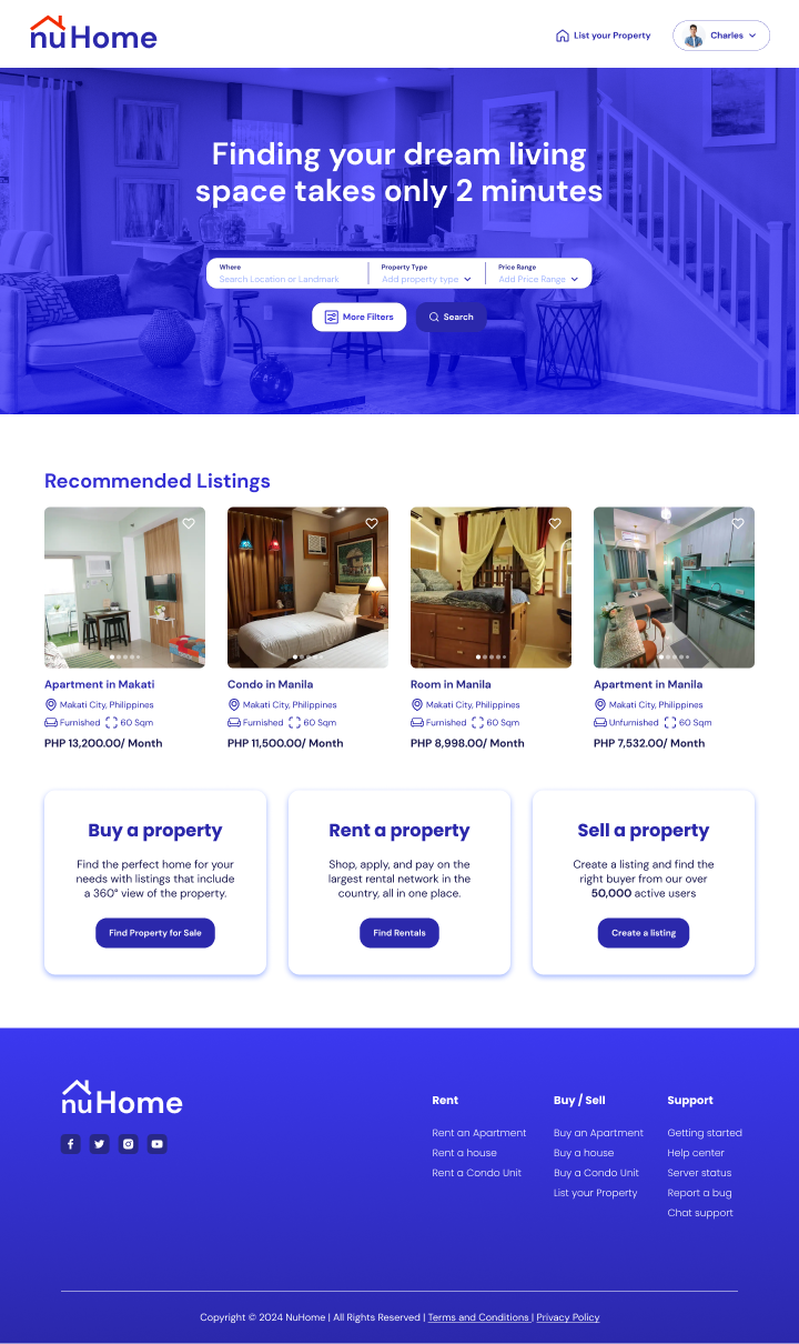
On the Home page, the primary focus is the large search bar in the hero section, catering to the top action users come to the website for - looking for a place to rent or buy. Also included here are recommended listings, where the website suggests listings based on the user’s previous search history.
Lastly on this page, we have three cards that identify the three major actions or flows that a user can perform on the website: Buying, Renting, and Selling a property. The first two will direct the user to the next page with a search function. The only difference is that depending on which card the user selects, they will have those specific listings toggled on to load.
Result Page
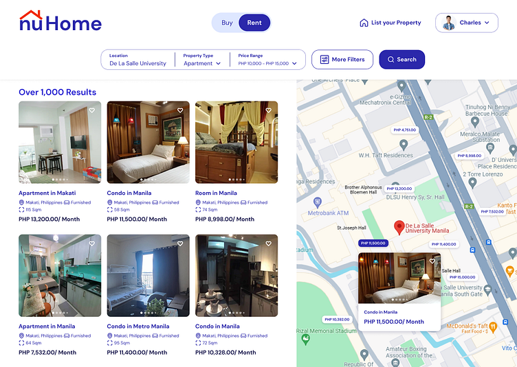
In the search results page, the user can toggle between rental and purchase listings. Depending on the selection, the website loads listings that are either for rent or for purchase.
I've also added carousel controls to the property listings, allowing users to browse through the images. This helps them visually assess if they'd like to move into the location. Additionally, we've included a map showing the distance from the searched location to the listing. This is crucial as, like in the provided example, users can select or discard listings based on their proximity.
Product Details Page
The Product details page has buttons that lead to a 360 view of the location as well as the photo gallery of the location. This allows the user to narrow down their selection of properties they want to move into without having to physically go to the location.
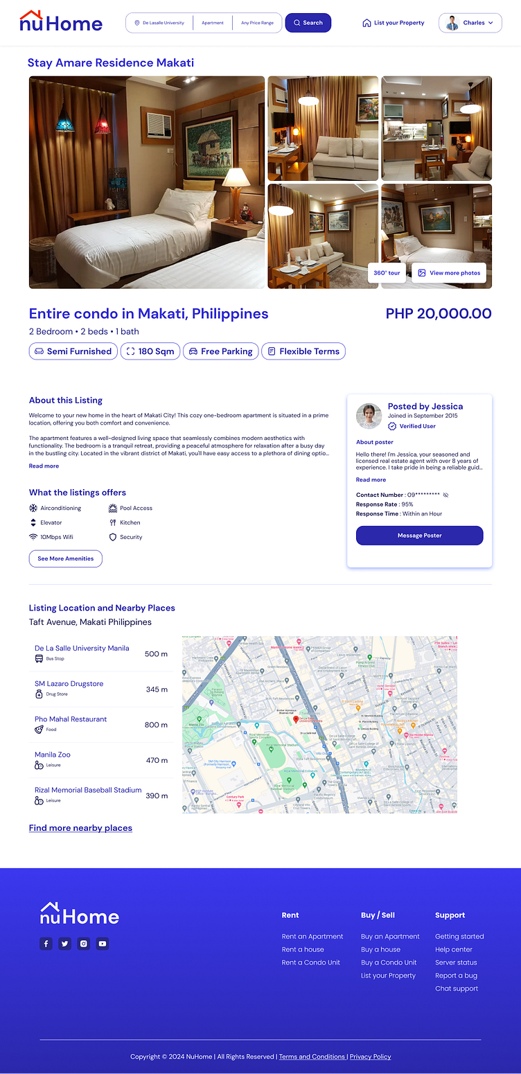
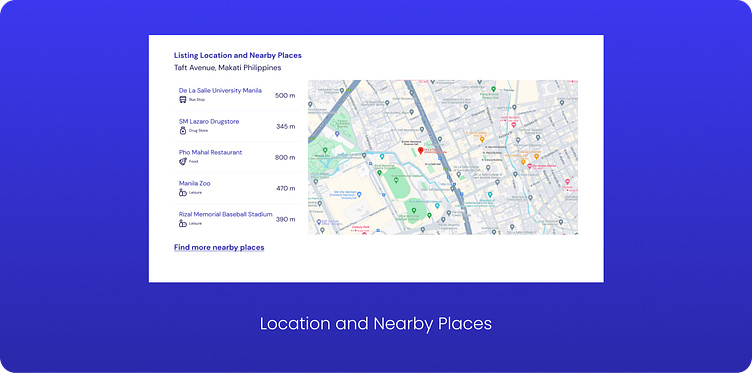
On the Product Details page, when the user taps on the "Find more places" link, a pop-up appears to provide a more detailed method for discovering important accessible locations around the property.
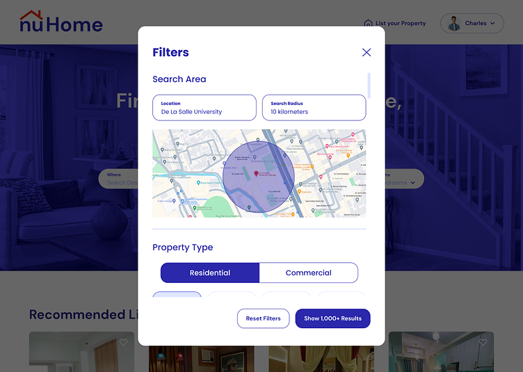
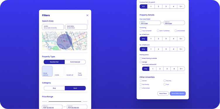
Search Filters
The user can refine their search results by tapping the 'more filter' button. This opens a modal that allows for a more tailored search, specific to the type of property they are seeking.
One of the fields that we included in the search filter was the search radius. This is helpful for users to narrow down properties that are conveniently located near their destination. In this situation, this is beneficial for the persona, who is a student. This feature helps them tweak the results to properties that are within 10 kilometers of the school.
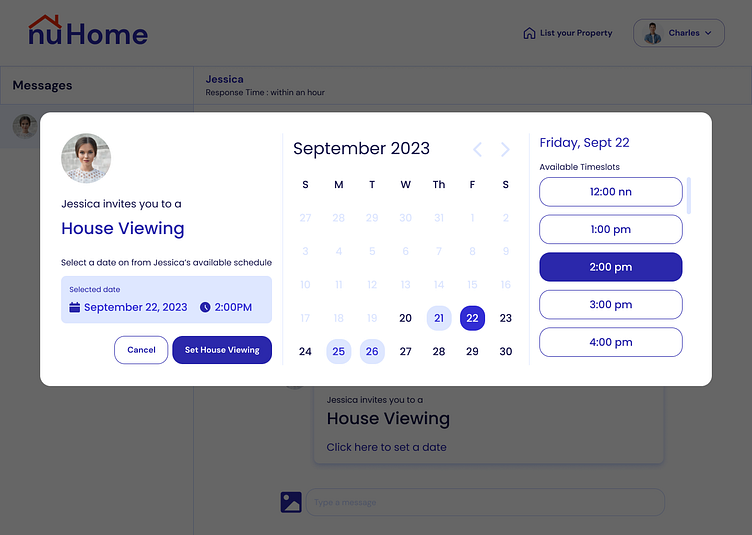
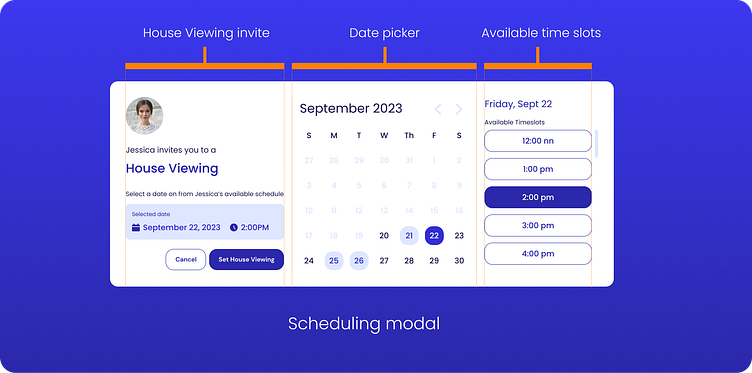
Book House Viewing
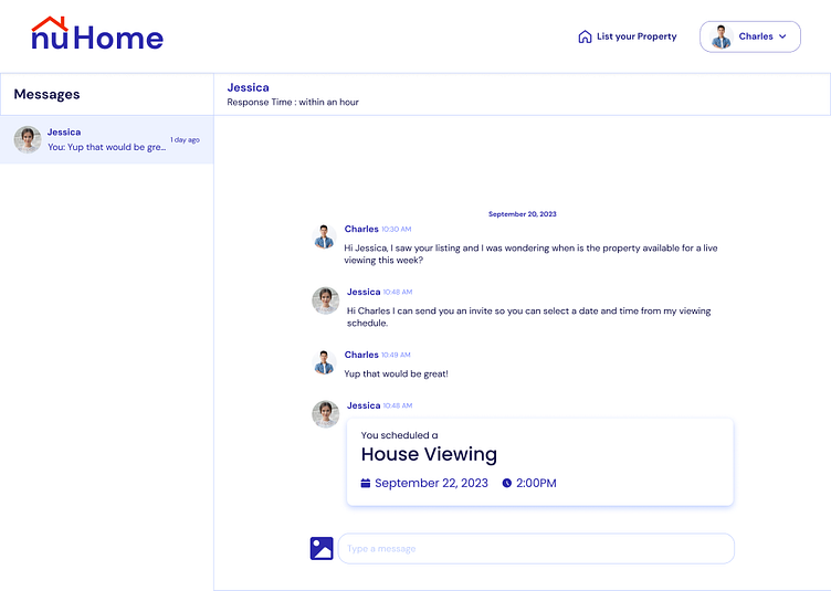
To address the challenge of messaging and contacting property owners in traditional property search methods, I incorporated a chat feature. This feature enables users and property listers/agents to communicate effectively and share information about the listing.
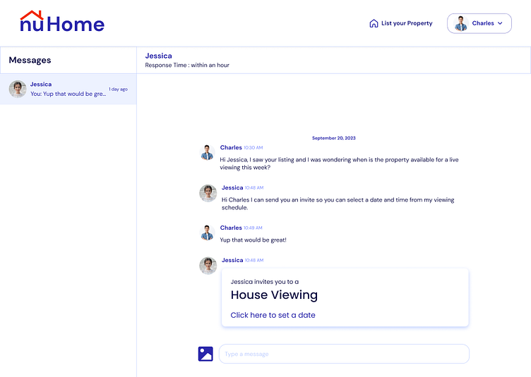
The chat feature includes a scheduling tool for property listers or agents and users to arrange a house viewing according to the lister's availability.
The lister can send an invitation, which the user can click to open a modal window and schedule the house viewing.