Re-Rolling Roll20’s Landing Page
How might we update the Roll20’s landing page to increase conversion.
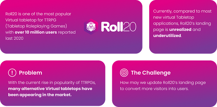
For this case study, I took up the task of redesigning one of the websites that I frequently used along with my friends, Roll20. Roll 20 is a Virtual Tabletop where users can play online tabletop Role-Playing Games(TTRPGS) with their friends online. As much as me and my friends do enjoy using this website for our weekly DND play sessions, we’ve noticed that it’s website isn’t the most updated and hasn’t fully utilized it’s landing page compared to its contemporaries.
Background
But first, where to start? (initial Audit)
Enter your text here...To start the process, since this case study is for portfolio purposes and is unofficial, I started with exploring the website and auditing it. This will help me to inform the changes that I will make to the landing page beyond updating its aesthetics to modern standards. This is important since I don’t have direct access to stakeholders. With this audit I try to understand and identify what was Roll20’s goal with the website.
Redesign
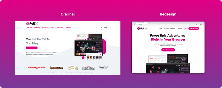
The original Roll 20 landing page had a great visual design. However, it had many user experience issues:
Website typography is not optimized
Some elements are placed awkwardly across the page.
Feature showcase is too visually cluttered.
Blog section not fully utilized.
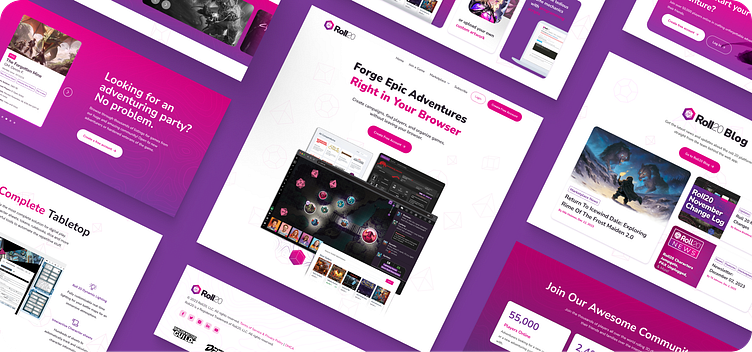
After going over all the issues I started mocking up design solutions for each page. Below is a comparison between the original landing page design and the redesigned one.
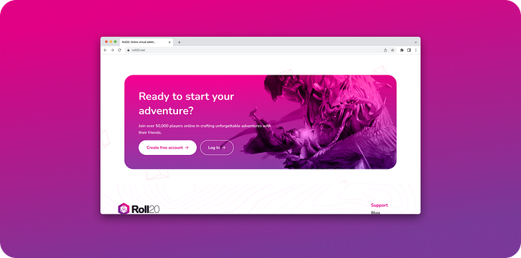
1.) Hero Section
Before
For the Hero section of the website, the current hero copy doesn't fully communicate what the web application is used for, which is to play TTRGs (Tabletop Roleplaying Games) with friends and family over the internet.
After
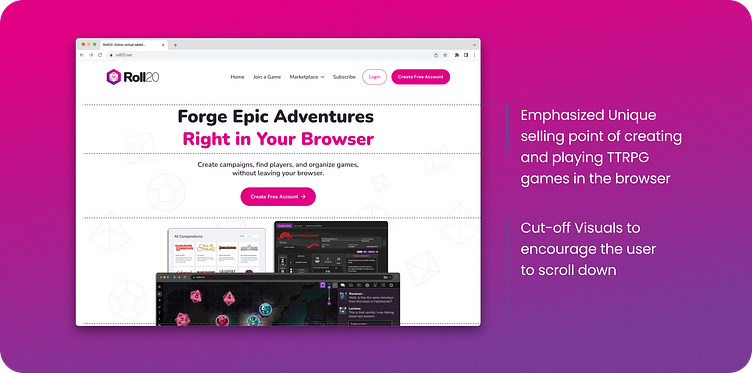
With the Redesign, I took this opportunity to change the copy by improving the hero copy to not only include the use of the web application but also it's unique selling point, which is all of the features are done inside the browser without the need of downloading and installing additional software.
Another change in the design is the use of the cut-off visual that encourages the user to explore more of the landing page where the website can have more opportunities to convince the user to adopt Roll20 as their virtual tabletop.
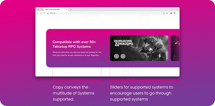
Another section included in the former design was the strip of logos for the compatible TTRPGs that Roll20 supports. In the redesign, it's made more visible and readable to make the intended message clearer.
2.) Features Section
Before
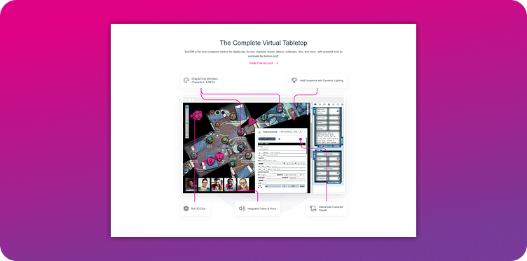
Although the current website highlights the unique features of the web app, the illustration is far too busy to distinguish each feature from each other. The lines used to label each features get lost in the visually busy illustration, working against its intended purpose.
After
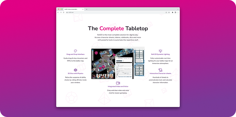
With the redesign of the features section of the landing page. I improved the visual Hierarchy to make it more scannable. I've also omitted the lines that connect the feature to the image and opted for a hover state that highlights the feature where the cursor is currently hovering over and dims the rest of the illustration.
I've also included a video that showcases it's behavior when the user hovers over the features which highlight the section in the illustration
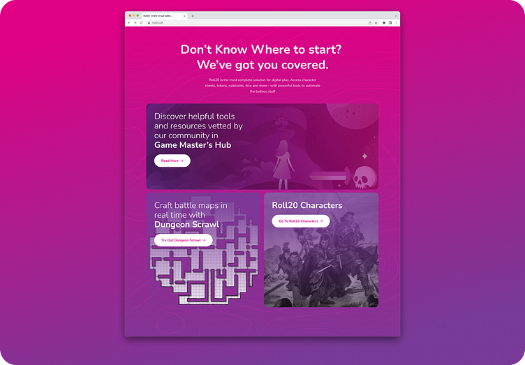
3.) Customization
Before
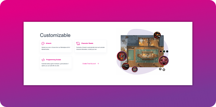
For the customization section of the landing page, the current design gives a short description of each customizable aspect of the web app. One of the missed opportunities that I noticed is that their marketplace isn't given enough attention and is relegated to an offhand remark.
After
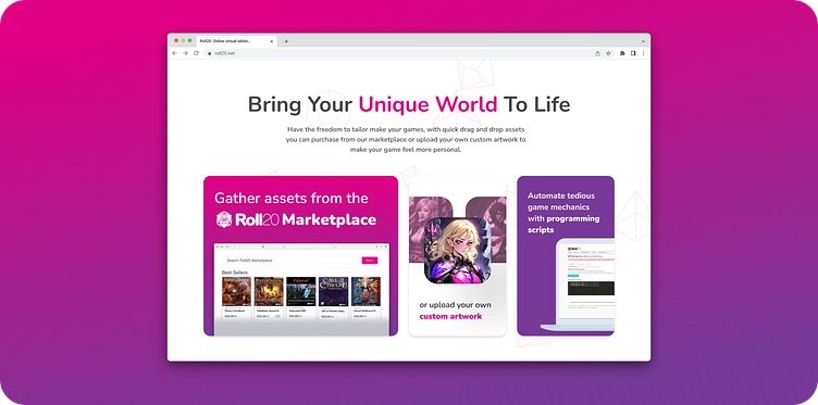
Enter your text here...
4.) Community
Before
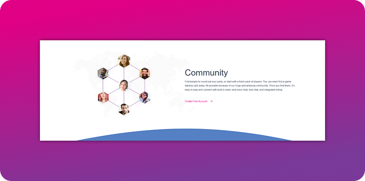
For the community section of the landing page, the current implementation is purely describing how easy it is to find a game. This lacks more concrete evidence of its thriving community, and the user relies on simply trusting the caption.
After
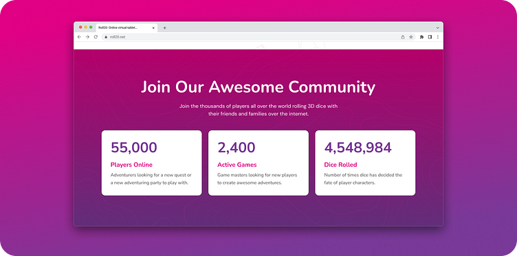
With the Redesign, I included a social proof section that shows in real-time, the number of concurrent online players, active games and dice rolled in the web app so far; the latter included since dice rolling is a major part of the web application and to inject a sense of humor and character.
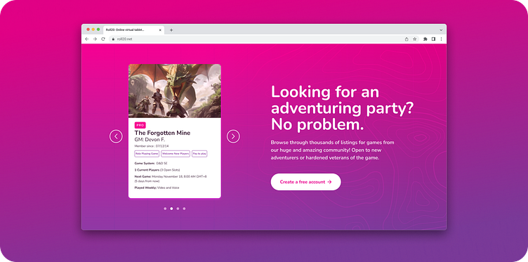
I also included a carousel of live games currently up in the web application that players can join right now by creating a free account. Previous iterations of this page had it's CTA labeled as "Join Game", but upon consideration, I opted to use the create a free account to funnel the user to account creation first.
5.) Blog
Before
The current implementation of the blog section in the landing page for whatever reason is currently broken. With this it gave me freedom to play around with in the design.
After
One of the initial inclusions that I made was to include a section that highlights existing tools and resources for GMs (Game Masters) to make the transition of starting a game with friends easier. I initially focused on giving resources to GMs since additional players/users are brought onboard when a GM decides to use Roll20 to run their games.
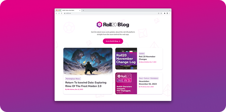
Though after careful consideration I’ve decided to exclude the GM resources in favor of focusing on funneling the user to sign ups. With that, I've retooled the blog section to show the latest news from the web app's creators. I've kept this section since it's a great indicator that the web application is still fully supported by the team and is also an opportunity to be used as advertisement space for their promos.
6.) Final Call to Action
For the final inclusion i've also included a final call-to-action section so that when a user browses through all the parts of the landing page, they didn't have to scroll up to look for a sign-up button, thus reducing the friction for when the user wants to sign up.
