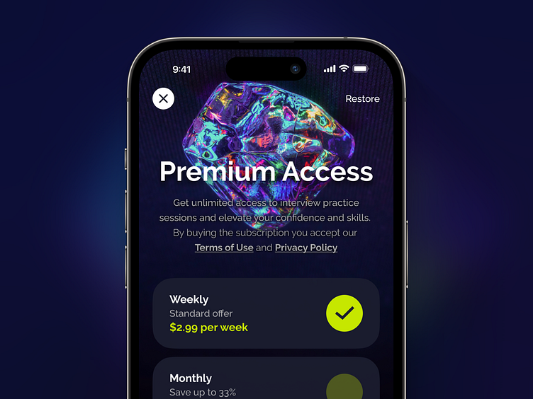
Premium Access – Subscription Paywall Design
Each paywall screen design in iOS apps should follow Human Interface Guidelines and strict App Store Review Guidelines. Sometimes, it can be challenging for beginners to get everything together and keep the structure clean and attractive.
Some useful tips from guidelines:
Provide clear, distinguishable subscription options. Use short, self-explanatory names that differentiate subscription options from one another, and specify the price and duration for each option. If you offer an introductory price, be sure to list the introductory price, the duration of the offer, and the standard price the customer pays after the offer ends.
Give people more information in your app’s sign-up screen. In addition to including links to your Terms of Service and Privacy Policy in your app and App Store metadata, the in-app sign-up screen needs to include a way for existing subscribers to sign in or restore purchases.
This paywall screen was designed for a subscription-based mobile app with interview practices. You can check the app here.


