G.O.A.T. Fuel | CRO
Working out has been a game changer in my life. Understanding how to optimize my body for peak performance has been a part of that journey. G.O.A.T. Fuel, Inc. is a high performance drink crafted just for that!
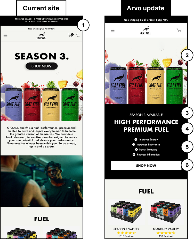
As a value add, I isolated 6 quick wins for their website. See the thread for the breakdown!
1) These are great call-outs, but make sure that you are simplifying the announcements and keeping them to the most important. Giving too many actions can cause indecision for the users.
2) Separate your image from the message to ensure that both are being communicated effectively.
3) There is no headline present to communicate what or who G.O.A.T. Fuel is. Leave the marketing speak as a sub heading and focus on what new users need to learn who you are.
4) Make sure your message is clear about who you are and what you are selling. Keep it short and sweet so that it can be easily scanned by a user.
5) Highlight the most important benefits of using your products. Keep them in a list form so that they can be seen easily without much scrolling or reading.
6) Make user engagement easy by ensuring key action buttons are full-width on mobile, and sit at the bottom of the fold.
