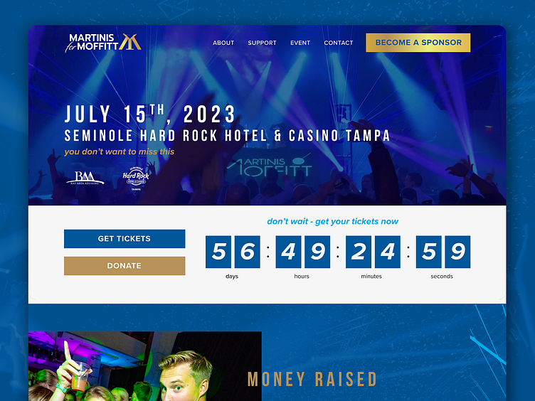
Martinis for Moffitt Website Redesign
In this site, we wanted to create the feeling of a party that a user wouldn't want to miss. Utilizing the gold gradient and party imagery, this website successfully evokes that feeling. With the main goal being ticket sales, sponsorship, and donations, we were conscious to make those CTA's prominent before the fold and easily accessible. These CTA's are repeated again in the footer to give the viewer another chance after they scrolled the website. This site was a blast to make, the client had great imagery and were open to more trendy, grid breaking styles.
More by C3 Media View profile
Like

