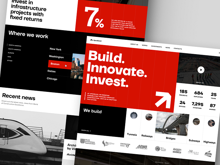
Construction Company Website
Landing pages have to be eye-catching to improve marketing strategies and attract potential clients. However, designing a fully functional page for something monumental like a construction company can be a challenge. Since the company specializes in building complex architectural structures such as bridges and subways, we opted for the brutalism style. It evokes the right feelings such as monumentality, reliability, consistency, accuracy, and scale. Brutalism is also connected with heavy shapes and blocks. That’s why the grid here supports the initial idea of construction: it’s pretty simple and solid-looking. The sections build the design ‘brick by brick’ and guide the user through the website thanks to carefully placed color accents.
Have a beautiful idea in mind? Let's collaborate!
design@conceptzilla.com
Conceptzilla
A design concept is what you need when time crunch doesn't allow for a complete process. This is where Conceptzilla comes in handy. We design up to four main screens of your product, ready for public display. Fixed price. One week.
Let's collaborate!
design@conceptzilla.com
Discover more about us at conceptzilla.com

