Domain Material Design Interaction
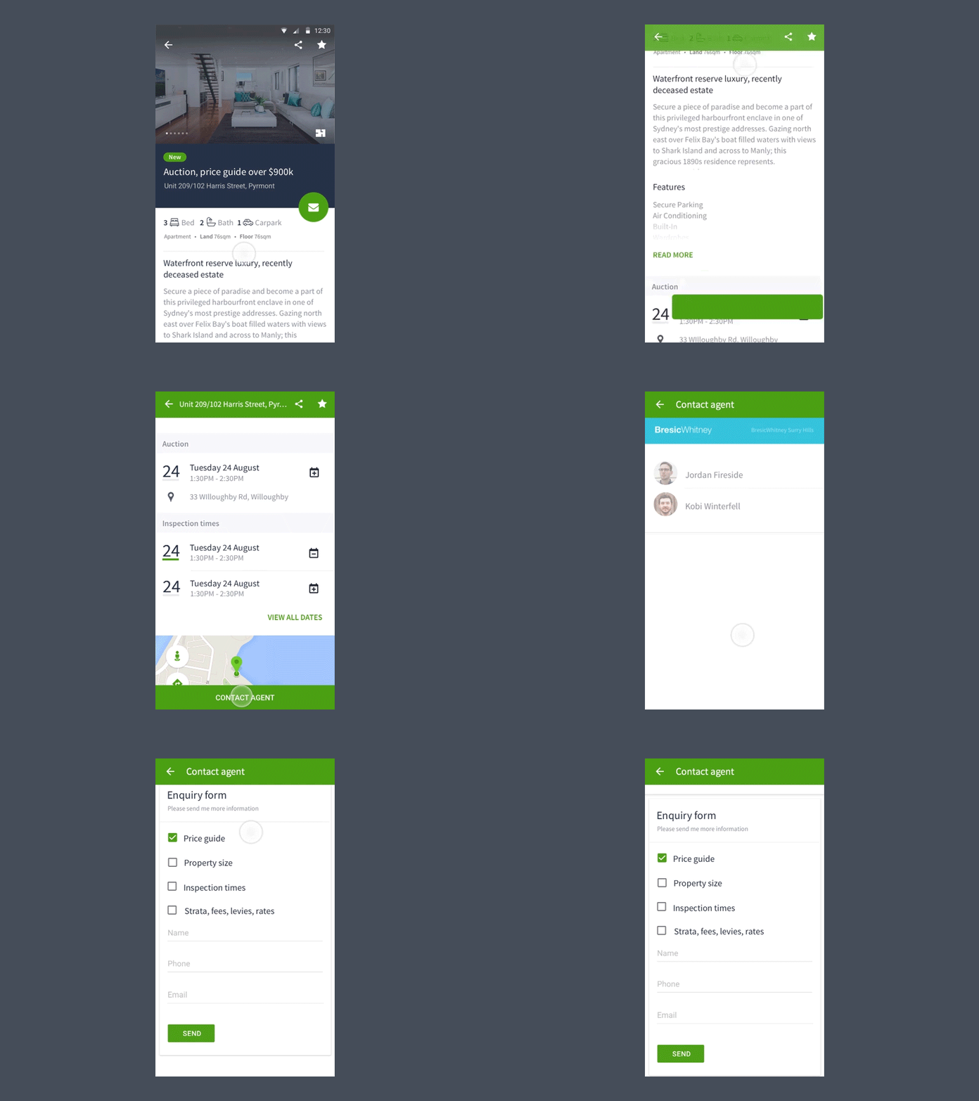
Put a prototype together in Principle displaying the core interaction between a couple of different elements on our newly (material) re-designed Android App.
There's 2 main interactions happening here. Firstly the back button, property address, share and shortlist icons are becoming sticky in the header section to retain engagement. Secondly, the 'contact agent' FAB is transitioning in to a sticky CTA at the bottom of the page. We're monitoring the conversion rate of the contact agent interaction and so far are seeing a slight increase here.
The best thing about working in an agile environment for a product that gets a massive amount of exposure is the way we can quickly split test concepts and use data to validate our design decisions. Making decisions based on data, and talking to our users is what it's all about.
Press 'L' to show some love :)
