Diet planning app
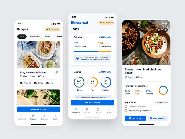
The first screen helps you sort through recipes based on your dietary needs and the type of cuisine you're craving, making finding that perfect dish a bliss for your heart! right?
Now, the progress bar in the middle screen is like a little motivational buddy showing you how many calories you've eaten and burned, along with some macronutrient details for the cuisine you've enjoyed.
On the very right side of the screen, you've got all the details about each recipe. We're talking about the calorie and macronutrient breakdown, plus a handy list of all the ingredients you need. It's like having your own personal nutritionist right there, helping you make informed choices about what you eat.
And finally, buttons, they are like shortcuts to action! Want to add a recipe to your log just tap on it and save it for later :)
Above design screens are inspired by myfitnesspal
Liked our work and want to work with us?
Email us at 📩 hi@dvinu.com or 📞schedule a call
---
Follow us on Dribbble • Twitter • LinkedIn
Visit our website 👉🏾[dvinu.com]
