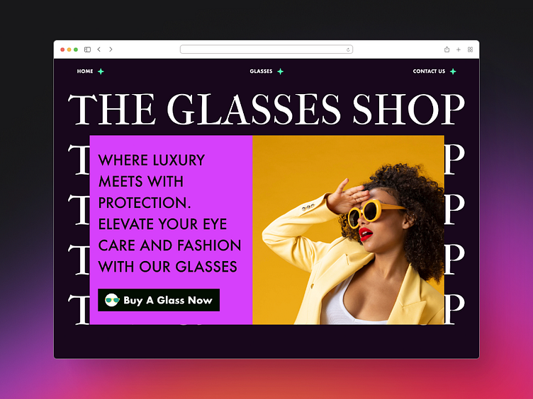
Glass Store | Landing page
Full Landing page 👇
What I did here was simple. I stole from other designers, more like stole like an artist. if you are here you're probably here to find inspiration for your project too. The secret to this is gathering inspiration from different designers. Austin Klone would say when you do this, you create something new (which is also not totally new as no design is completely new) and it goes on and on,
Each of the sections from the Hero section to Footer was inspired by someone else work.
I also wrote an article on this breaking down the UX strategy behind every detail here and the design psychology used in making sure this landing page is one that will not only capture a person's attention but also lead them to what we want from them - to buy a glass!
👇 Click to read article on medium
https://bootcamp.uxdesign.cc/applying-psychology-principles-to-ux-design-10fad98a683b
(Applying psychology principles to UX design -- Designing High-Converting products_ Landing Pages)


