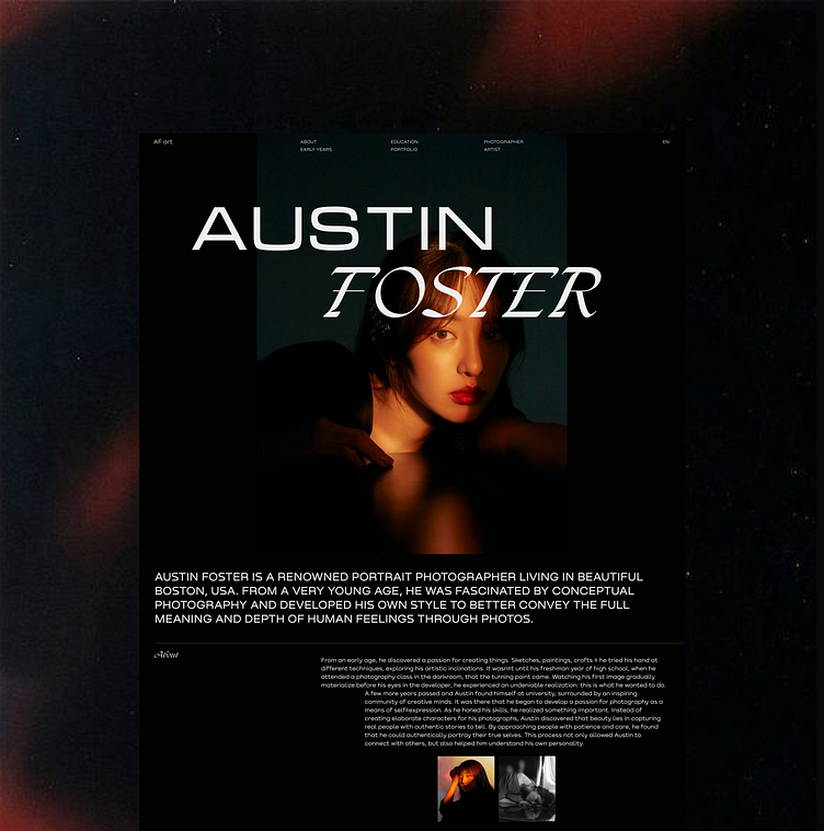
Website design of longread longrid for a photographer
I created a new stylish concept of the first screen for a photographer's biography website 🔥.
In order to make the first screen immediately attract the attention of users and potential customers, I took the following steps:
📌I chose interesting but different fonts and created a non-standard combination of them, focusing on the photographer's name. I did this so that the user's attention would be drawn to the initials, thus making it memorable to potential customers;
📌 Created an interesting composition that immediately attracts attention and demonstrates the artist's modern and stylish taste;
📌 Chose an aesthetic and mysterious photo that immediately attracts attention. In addition, she used this technique to immediately demonstrate the style of the artist's photography.
📌 To make the design look stylish, modern and "artistic", I used bold typography and non-standard text placement.
If you are interested in my services, please contact me directly.💌 I will be happy to create a unique product for you. ♥️☺️
