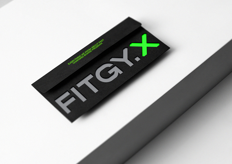
Fitgy.X
The branding is smooth and clear, with all the dynamics in the color palette and details. If you take a closer look at the logo, you can see slices on the letters. This is how Fitgy.X cuts off the unnecessary, both literally and metaphorically. Everything in the interior is comfortable and useful, even motivational inscriptions on the walls and a punching bag at the reception. The environment in which a person finds themselves should help them be productive. That's why the interior turned out to be energetic and strict, just like your personal trainer.
More by Reynolds and Reyner View profile
Like
