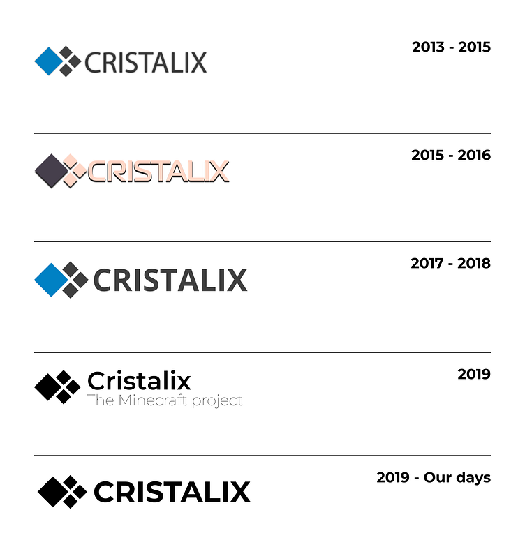
Cristalix History and Freshness
Goal
The goal of the branding update was to modernize the logo while honoring its history.
Process
Montserrat was chosen as the logo font because it was already widely used in the project design.
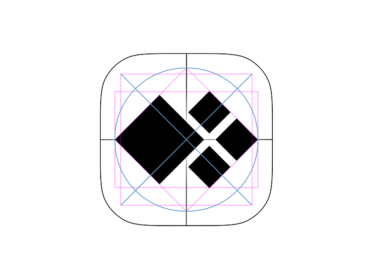
The original studio that created the icon did an excellent job!
The only adjustment needed was to resize and increase the thickness of the negative space inside the logo.
I don't know who you guys are, but you're awesome.
The font weight was increased to bold, and the letter spacing was decreased by 0.7% to make the logo denser.
I also removed the “The Minecraft Project” tagline since the brand is well-known and no longer needs to emphasize being a “MINECRAFT server.”
The icon's topology was redesigned from scratch, drawing inspiration from the earliest versions of the logo.
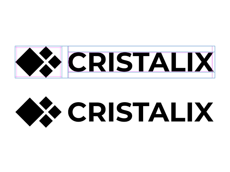
Icon topology

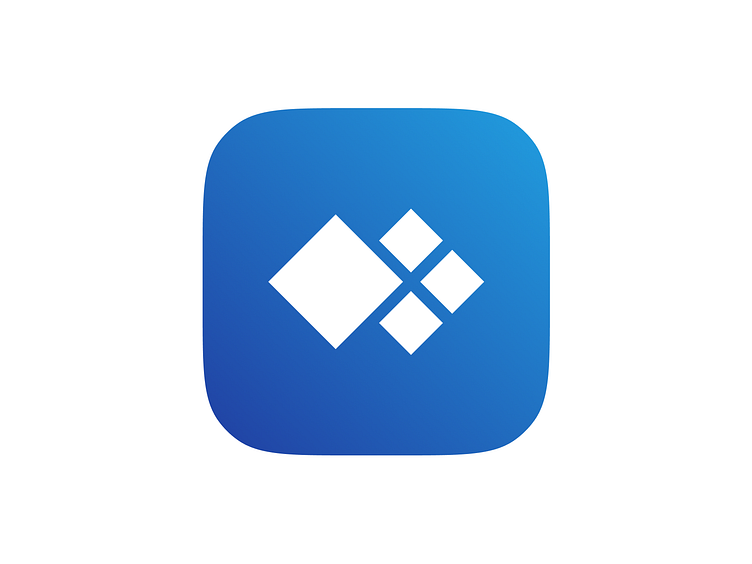
An example of using a logo in an application icon

Thank you for watching 💪👨⚕️